

Astro Design System
Shipt’s Design System
In 2022, I was given the opportunity to join Shipt to help build their design ops practice and design system from the ground up. Prior to me joining, Shipt had grown significantly due to being acquired by Target and high demand for last mile delivery spawned by the pandemic as was dealing with growing pains. Having prior experience working on design systems and moving from a larger organization, I was able to contribute towards the transformation process of moving from a startup to a mature technology company and design practice.
Astro Design System provides the foundational layer towards helping our business deliver products that are simple, inclusive, and complete. We help elevate Shipt's brand, customers, internal employees, gig workers, and the partners we support through guidance, tools, and process optimization.
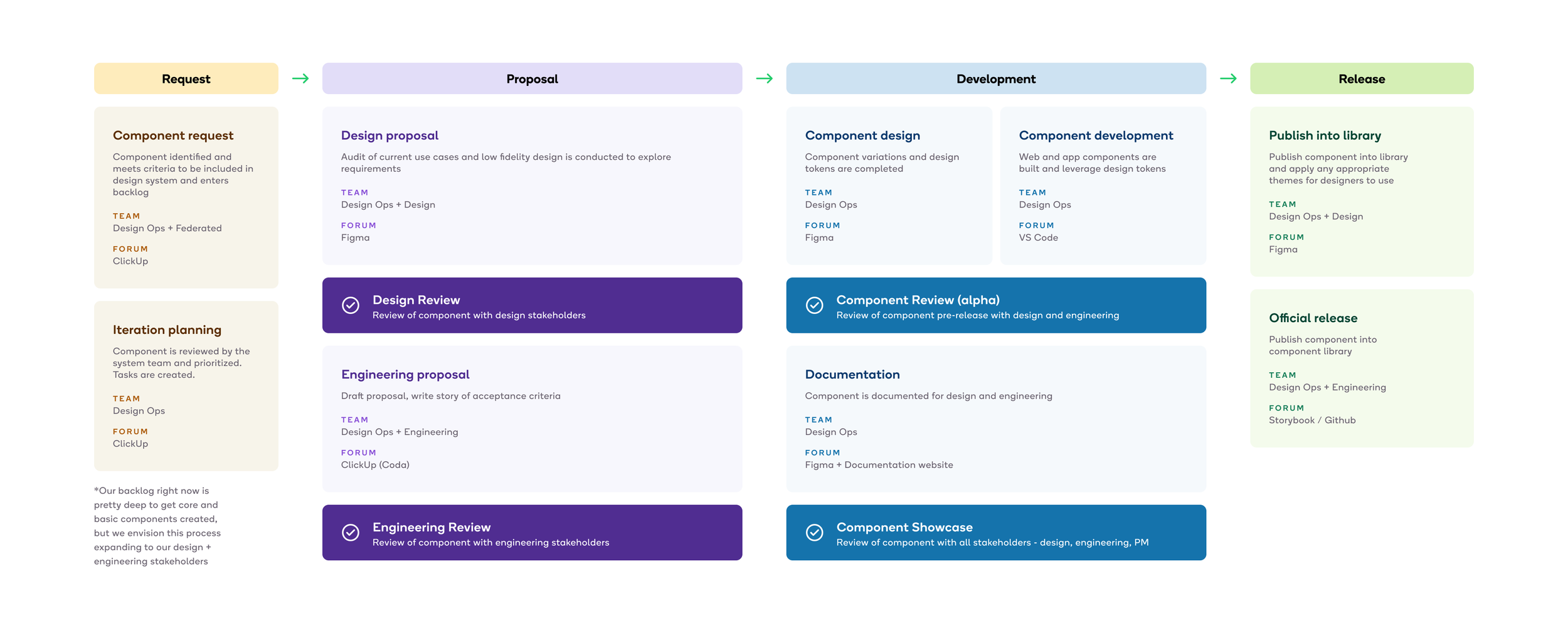
A consistent and predictable process
Astro design system's process is an evolving practice that is co-designed with design and engineering. Our process was created by observing how we make things and continual optimization through retrospectives and workshops with stakeholders. We embed that process into our operational and planning tools through templates and documentation that is visible by everyone. This ensures that we are following a consistent process and allows us to share steps of that process with others who would like to contribute.
Our rituals
Holistic efforts like design systems require a constant push and pull of input and feedback with the teams that we support. To make that happen, we have a series of recurring rituals that are inclusive to our core team, contributors, and the larger organization. This allows us to tailor an agenda and get appropriate feedback from stakeholders.
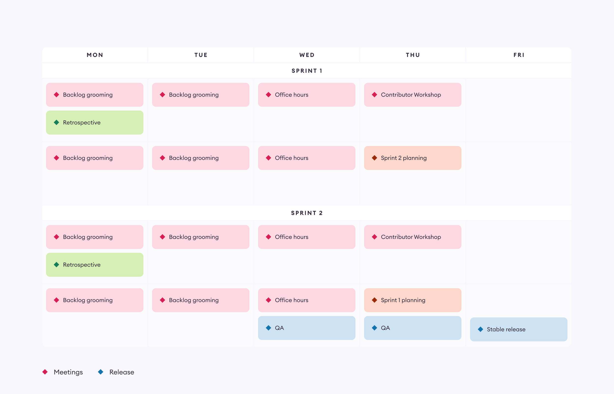
Sprint process
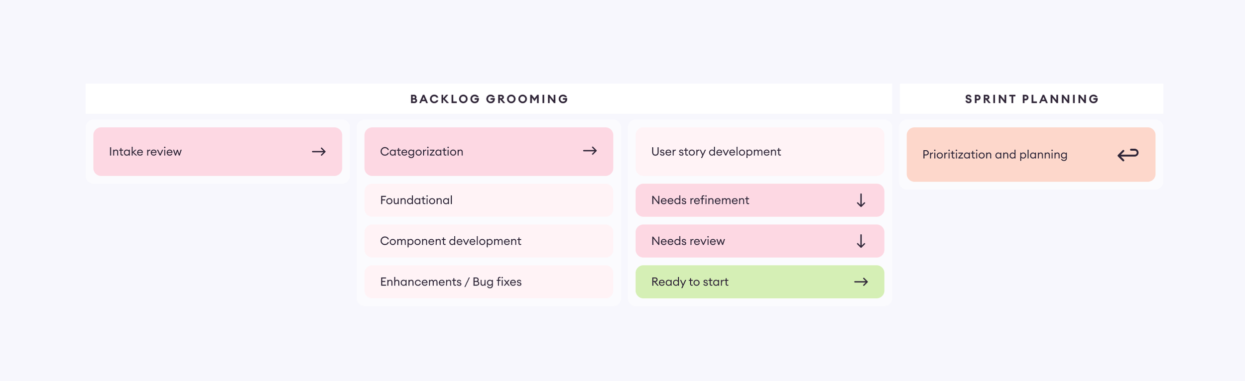
We have organized our planning and templates to follow a clear structure for backlog grooming and planning. This structure has made our process so much more efficient and clear to all of ourselves, and our users. Anyone can push requests through our intake and see how we categorize, develop it into user stories, and what sprint we are looking to do the actual work. Contributors can assign tasks to themselves or their team workflows with little overhead.
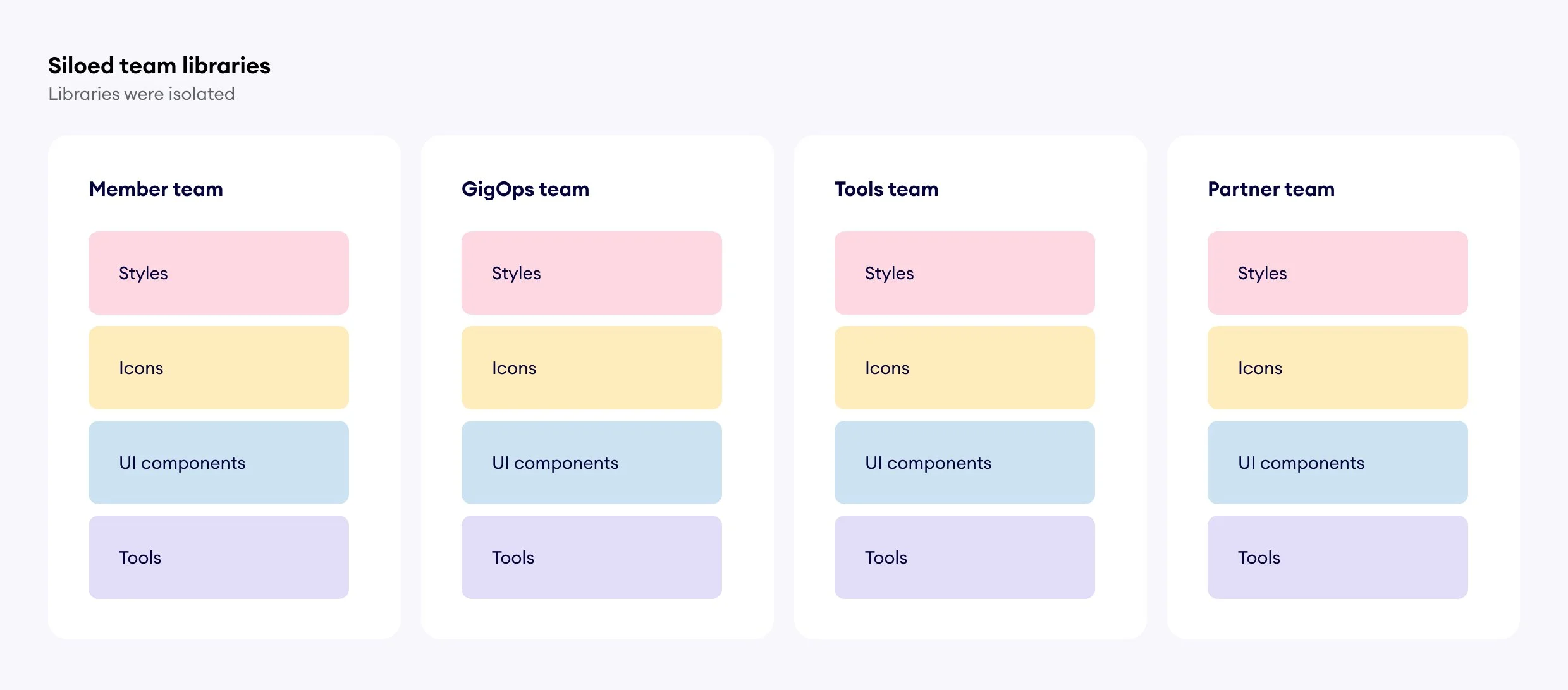
Organizing Figma libraries
Before Astro was created, each product had their team’s libraries housed in separate team spaces. This led to each team trying to solve the same problems with different executions and little cross pollination.
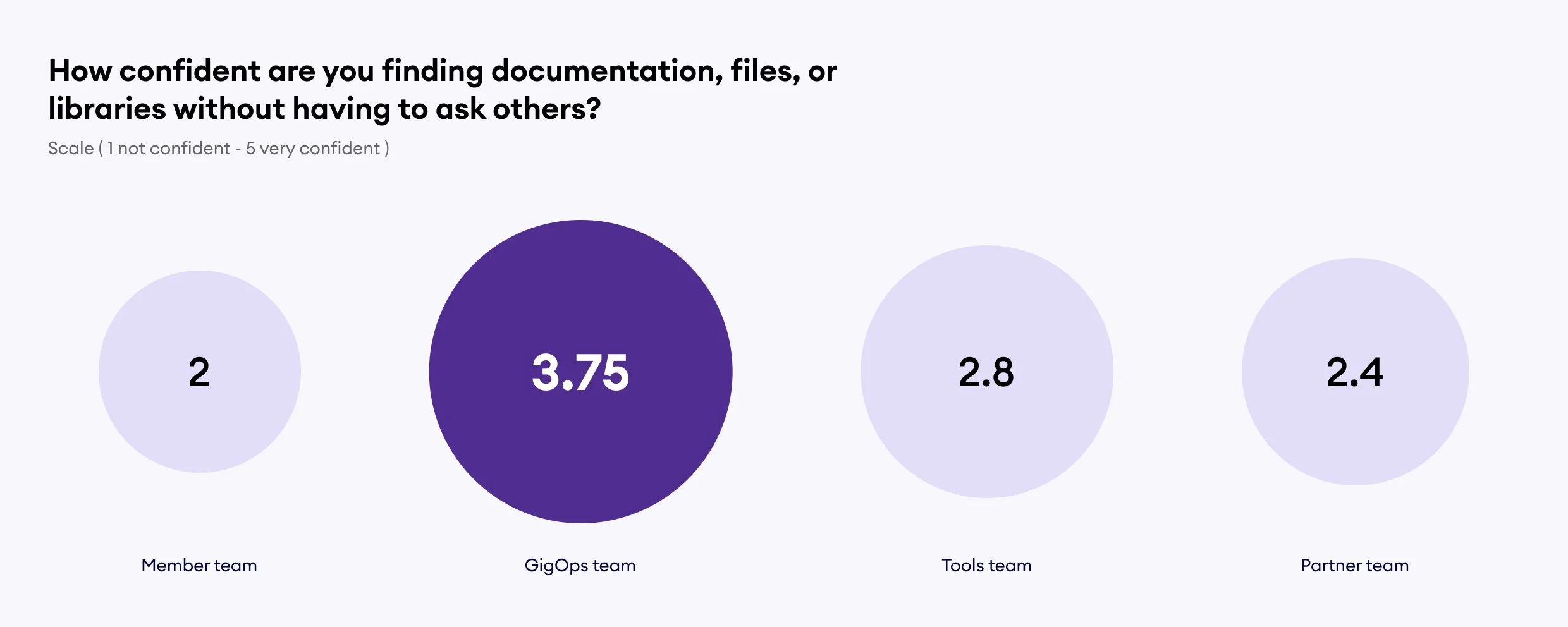
Qualitative study
When onboarding I conducted a series of interviews with stakeholders and performed a survey for the entire department to set a benchmark and get insights. There was a clear disparity of feelings towards their tools based on their team. Some teams were struggling to keep their libraries up to date, which led to dissatisfaction and a gap between designers and engineers. When digging in, some teams scored higher than others. When digging in, the team with the highest scores had the strongest UX resources on their team, and so had documented their work more, but was the furthest from the latest brand decisions. While the team that scored the lowest was the exact opposite; they prioritize looking great, but had little documentation as they were always adjusting and adapting.
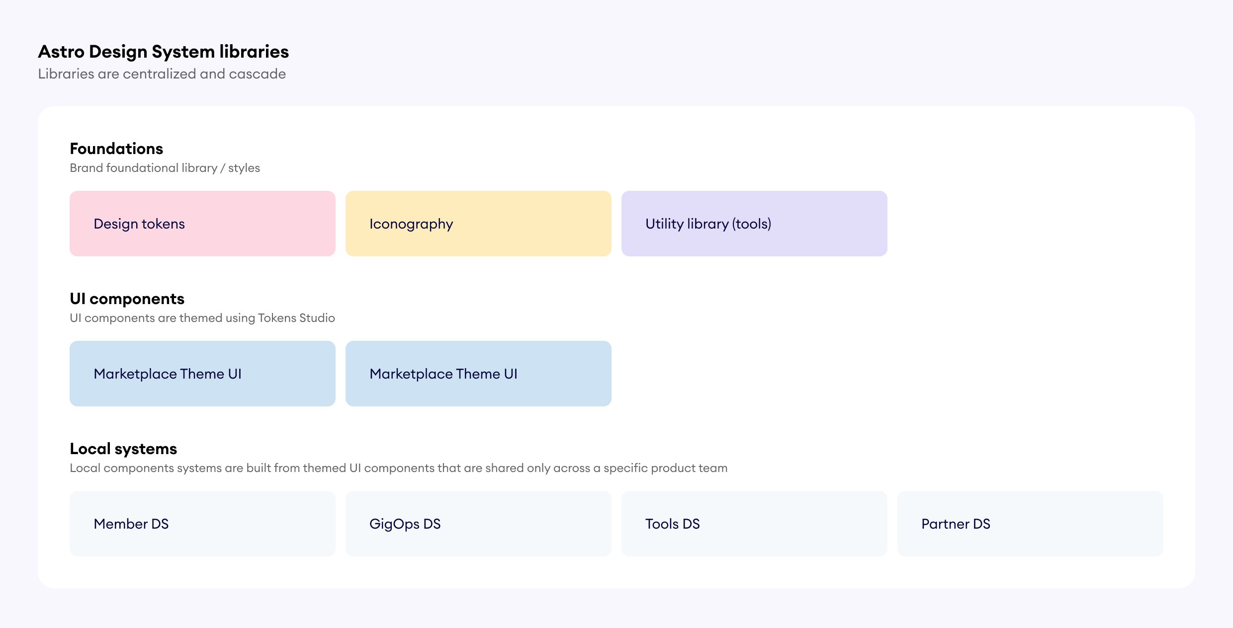
Astro’s Figma library structure
Astro introduced a new way of working that breaks up the toolset to cascade from high level atomic elements that are shared across the entire organization to very specific / complex components that are leveraged across one team. This allows teams to still create bespoke and specific things, but centralized them to increase visibility into what other teams are doing.
Design tokens
Design tokens are super powerful and provide all of the styling and brand decisions applied to our component library. They were co-authored with engineering so that they work for engineers and designers and our stored in Github as the source of truth. We leverage Tokens Studio to apply them inside of Figma, and have recently transitioned to exporting them into Figma Variables for increased usage and optimization.
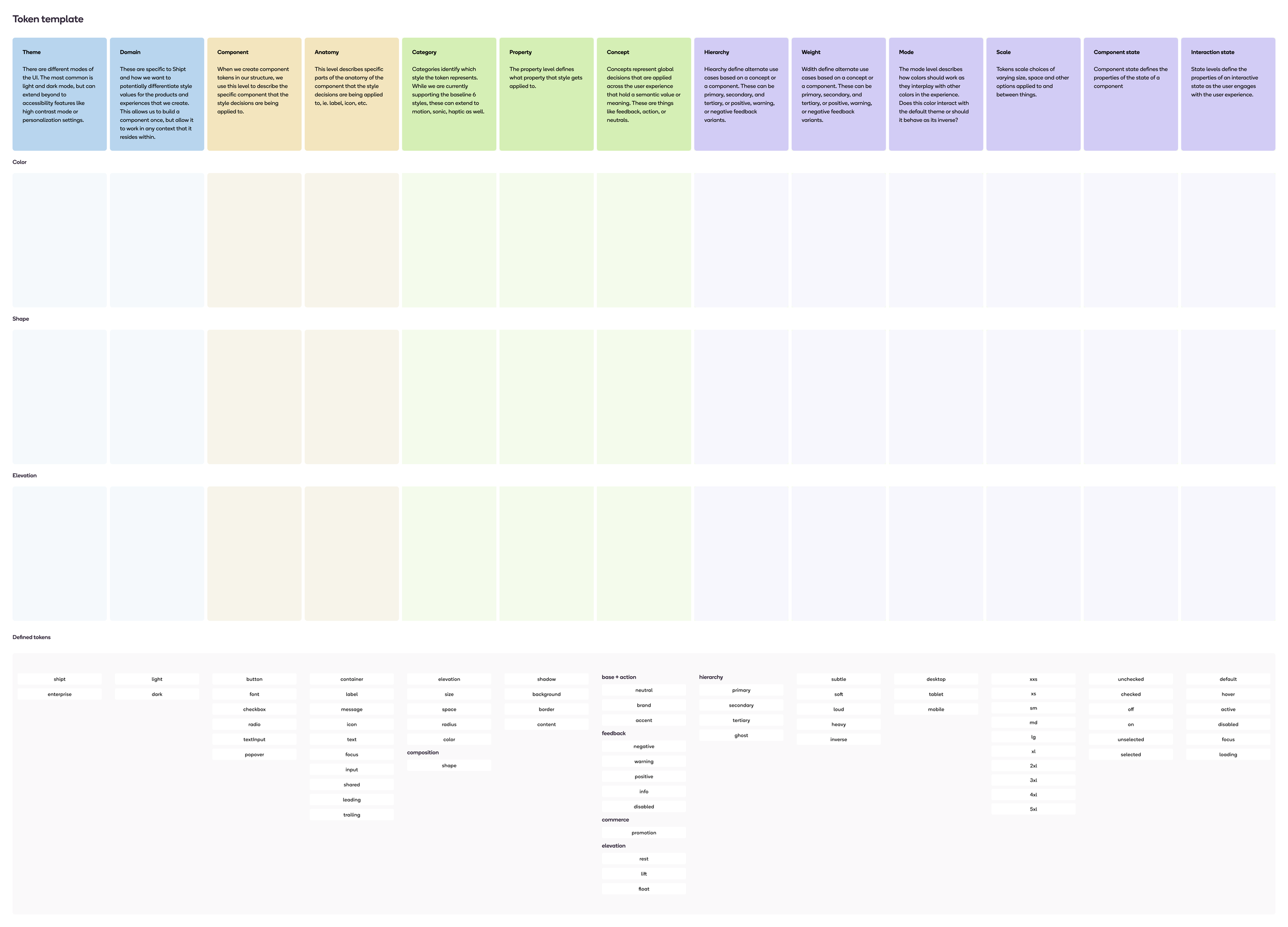
Design token structure
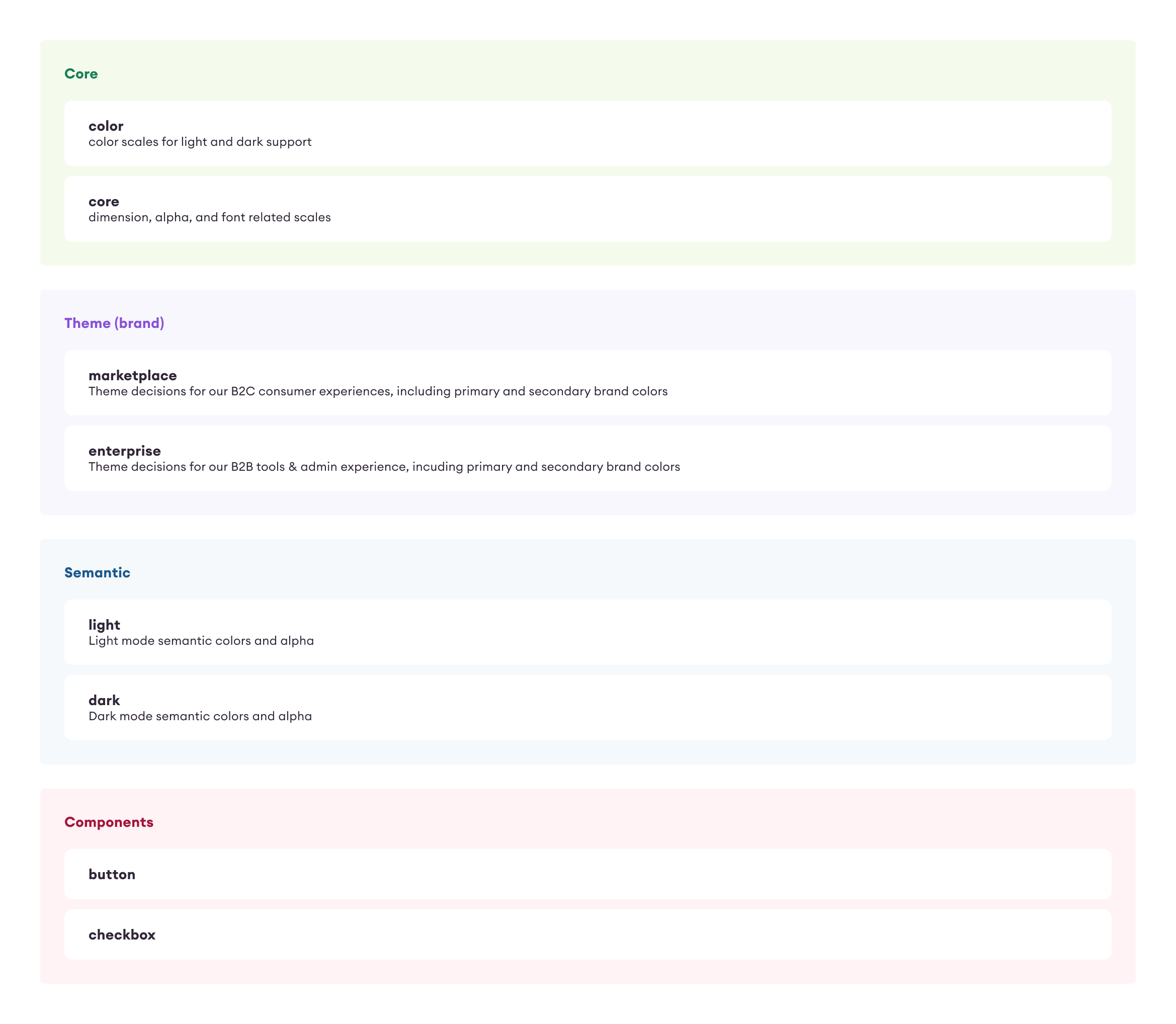
Our design tokens are organized to connect with each other and remain scalable and flexible. While Shipt is under one brand, we leverage tokens to enable our experiences to tailor itself to various contexts, user preferences, and devices.
Core - scales that are based on math or contrast ratio
Theme - specific root values and specific brand decisions that core responds to
Semantic - connects to core scales and defines how they are applied to specific functions
Component - how semantic decisions are applied to a specific component
Using math whenever possible
Math drives a lot of our core tokens. This allows the tokens to perform in a uniform and predictable way. Our scales are based on a static value and a rem value. This allows us to make component decisions where we can decide whether the component should respond to type changes or stay the same based on a context.
In this simple example, we can effect the type scale or the spacing scale based on different base values that can be set at a theme or mode level.
Defining contrast ratios for color
While there is recent progress towards making color decisions more math driven, at the time we were defining our colors, we focused on targeting contrast ratios to make color behave more predictable. This ensures that the color behaves similarly across different backgrounds and situations.
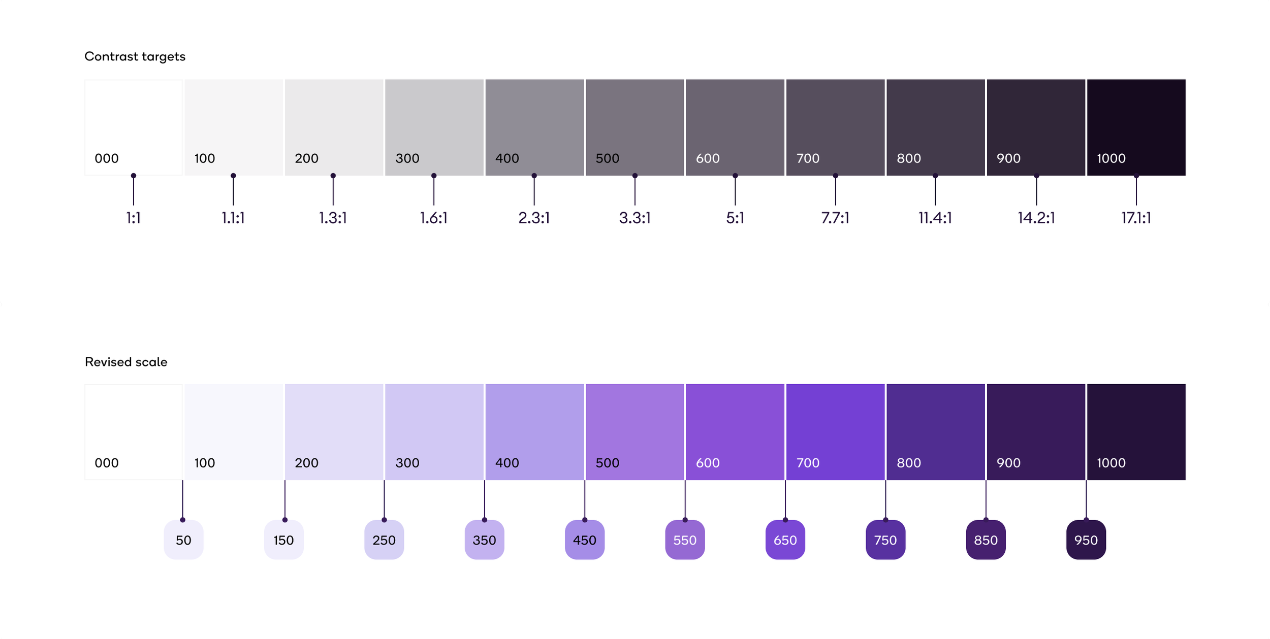
Prior to Astro, teams had used color scales, but they were defined optically. In the audit below, colors that were set in the scale at 500 ranged in their contrast against white from 2.3:1 to 11.4:1. This makes having scalable and repeatable decisions super difficult.
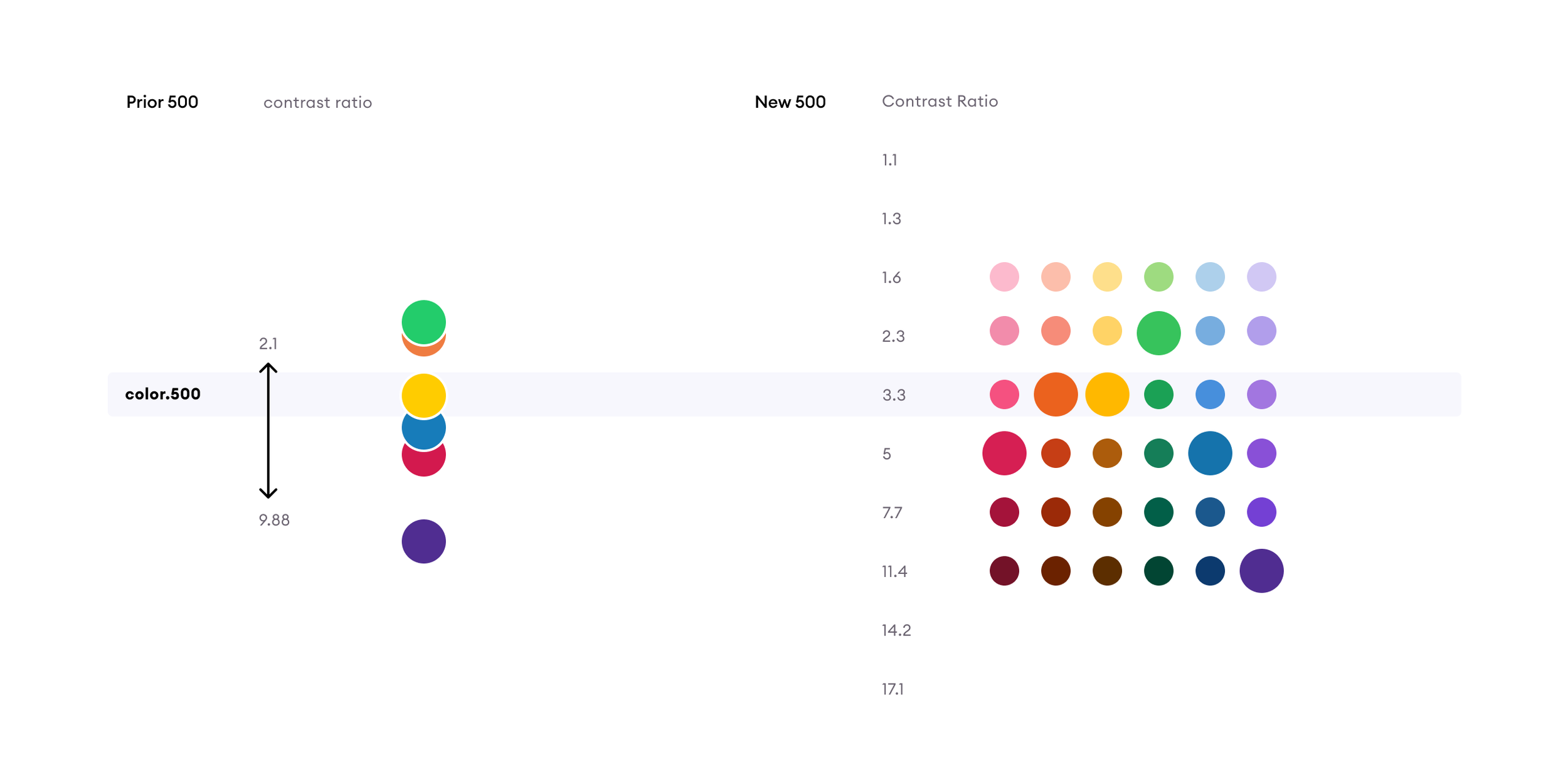
I remapped all of the prior colors so that they would perform more uniformly by using a scale of contrast levels. When colors didn’t exist, I used the Leonardo Color Generator. From there, I fine tuned them using HSL. Shipt’s colors were bright, so the saturation needed to be adjusted so it was more optically cohesive while staying as close as possible to the desired contrast ratio.
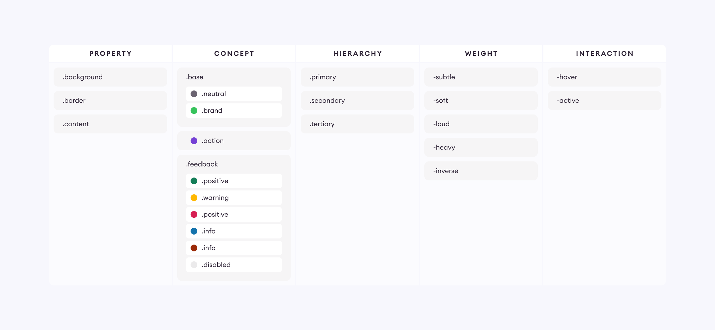
Semantic naming conventions
Myself and an engineer worked closely to develop our semantic design token structure from scratch. We started the process leveraging Nathan Curtis - “Naming Tokens in Design Systems”. While this was a good starting point, names got very long and cumbersome so we simplified them. With the introduction of Figma Variables’ constraints, we made a few tweaks to make it easier to apply them by making the property category first.
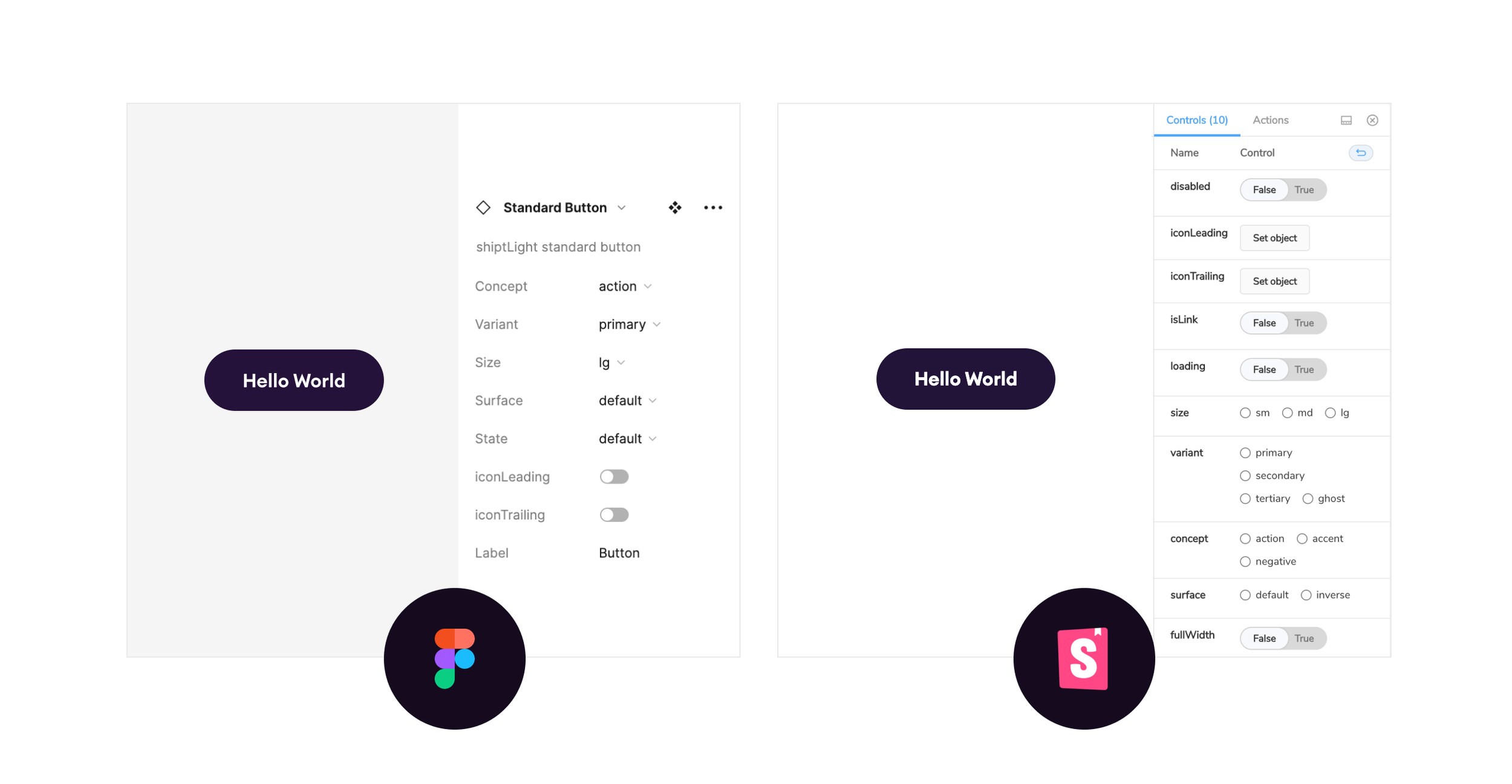
Component tokens
Using tokens for component decisions gives the designer a lot of control even after the components are built. I can simplify make a change, push it to GitHub and see that change in the component without requiring any engineer overhead. To make the naming process easier for contributors, I created a template that is drag and drop and is included in our component template file that we use when creating a new component.
Using themes to add flexibility
Shopify's Ricardo Vazquez has a presentation about his experience designing the retail point of purchase experience. He speaks about how its important to keep the sub-purposes and overall purpose of the design system in harmony. What this means is that user context has as much of a say as global efforts to make everything consistent. Astro offers this flexibility through the use of themes. Themes allow team's decisions to tailor our components to different user contexts so that they are always appropriate.
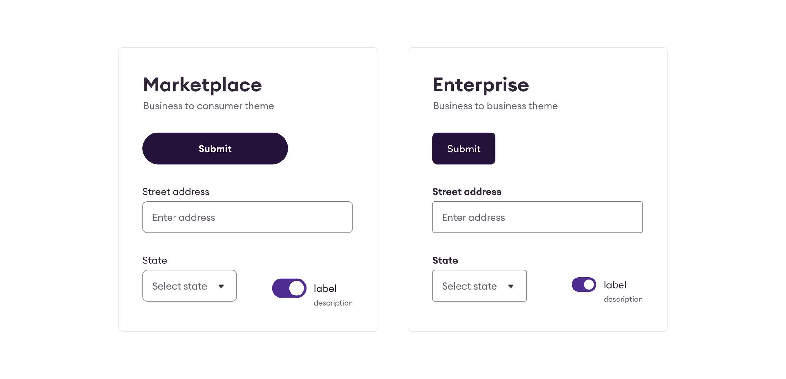
Themes that we support
While Shipt is one brand, we create products that address the needs of many different users. To explain this, I like to use the metaphor of a theater. You have the audience’s view where everything is beautiful and things magically happen. Then you have behind the curtain, where things are more utilitarian. You see the ropes and levers, the backdrops are organized and ready, props are waiting in the wings. All of this is an orchestration to power the audience’s experience.
At Shipt, our audience experience is the marketing pages and the marketplace apps where our customers go to understand and use our products. Our behind the curtain, is internal facing tools that orchestrate those experiences behind the scenes. These are the apps that support our GigOps workers, support specialists, and the retailers that we partner with.
While our themes share the same DNA, they are considerate of things like information density, platforms, and other contexts that may influence the user’s ability to interact with the experience.
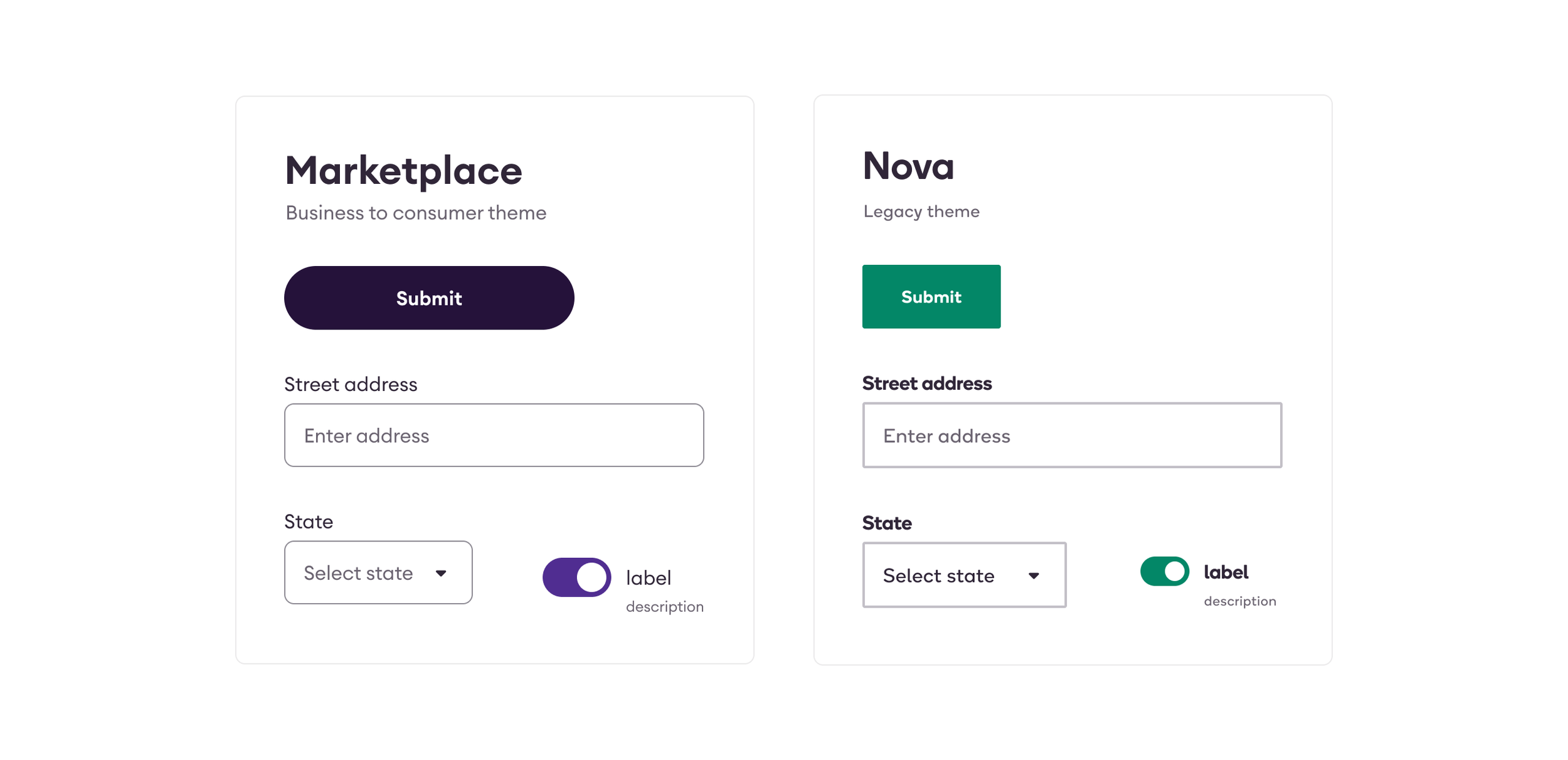
Using themes to migrate legacy products
We also use themes to remove visual style as a blocker to adopt the design system. We want teams to use our tools, even if they they don’t look like how they should look yet. Our internal tools team was three iterations behind the latest brand decisions. On top of that, it was built leveraging multiple component libraries from material-ui, bootstrap, and a locally owned library that they were struggling to maintain. Seeing that we could theme our components to not disrupt their user experience while in a transition phase made adopting the system feel less a lot easier to buy into.
Similar to how multi-brand token concepts are applied, we are able to capture old visual decisions and apply them to new Astro components. This allows the teams to adopt Astro components and have it live alongside legacy components without any visual disruption to their user base. Since we are also able to measure their migration, we can make an informed decision when we can consolidate and switch their experience into the appropriate correct theme.
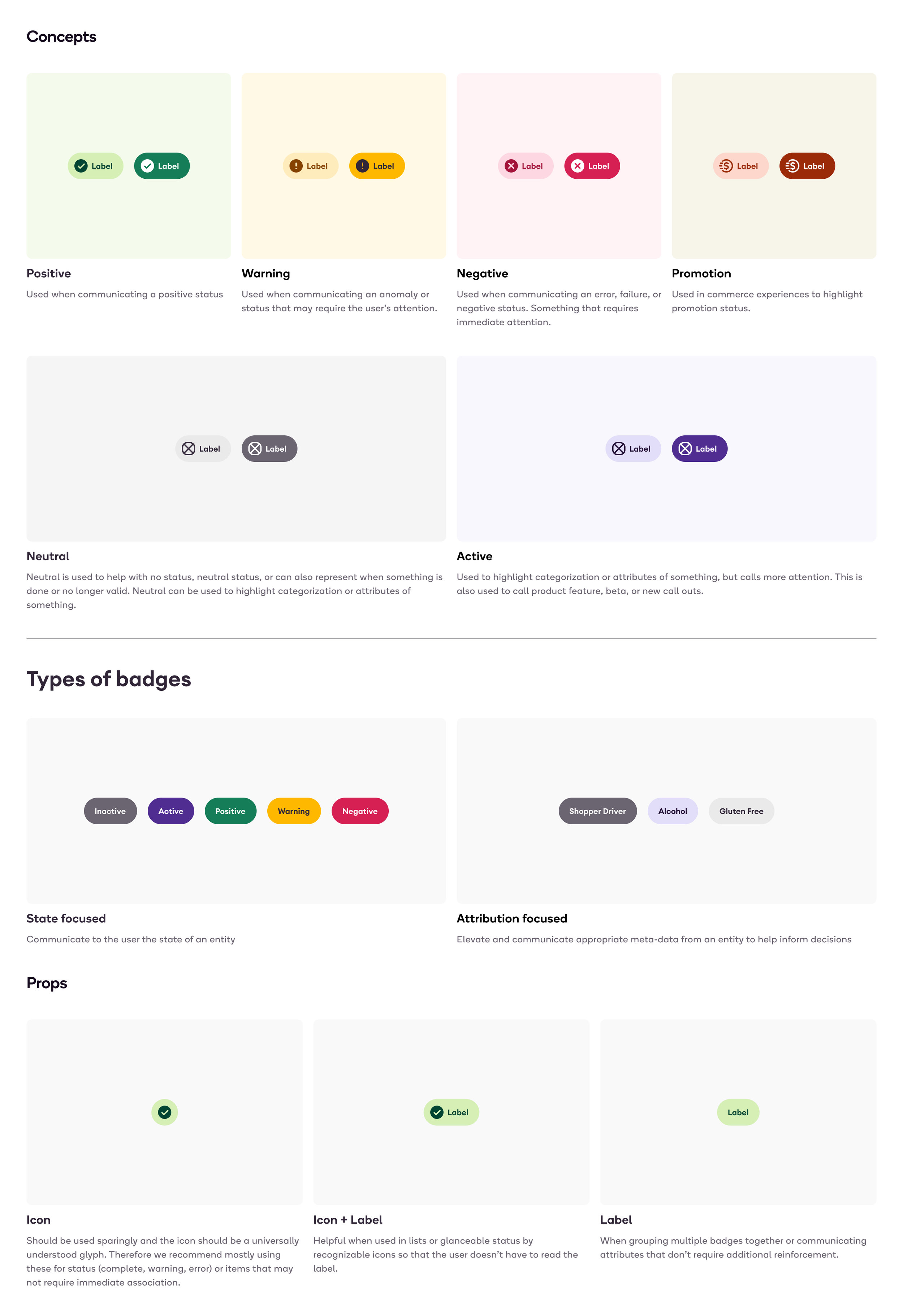
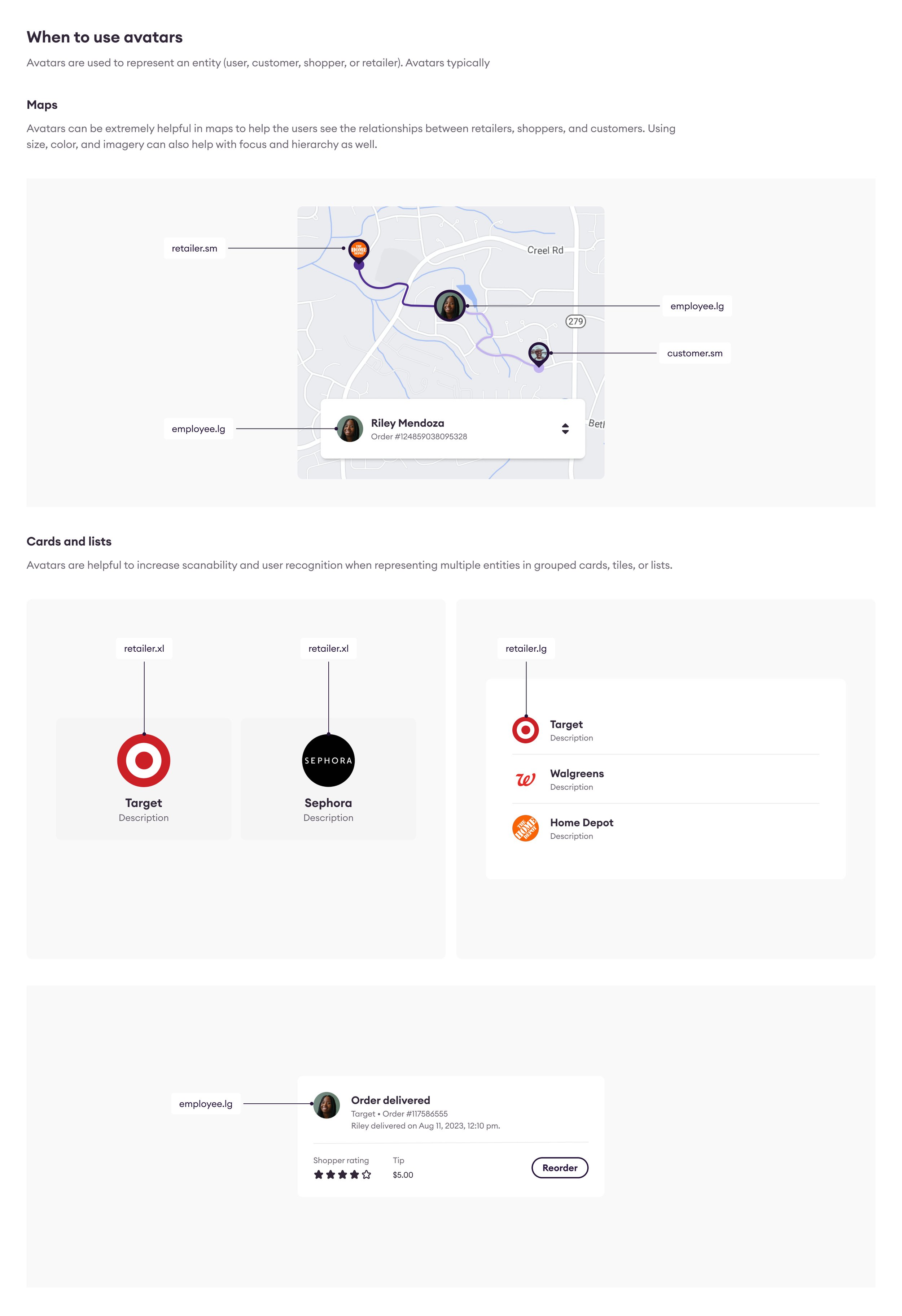
Components
Astro components are built by both our design systems team and inner source contributors. For every component, we leverage the same process, component templates, and documentation so each step towards making a new component is comprehensive and consistent.
Component templates for Figma
The Astro component template inside of Figma aligns with our overall process. Anytime we go to design a new component, we duplicate the file and follow the process that is outlined in each step of the file. These become a lot of the source material for engineering proposals and future documentation that we provide on our documentation website.
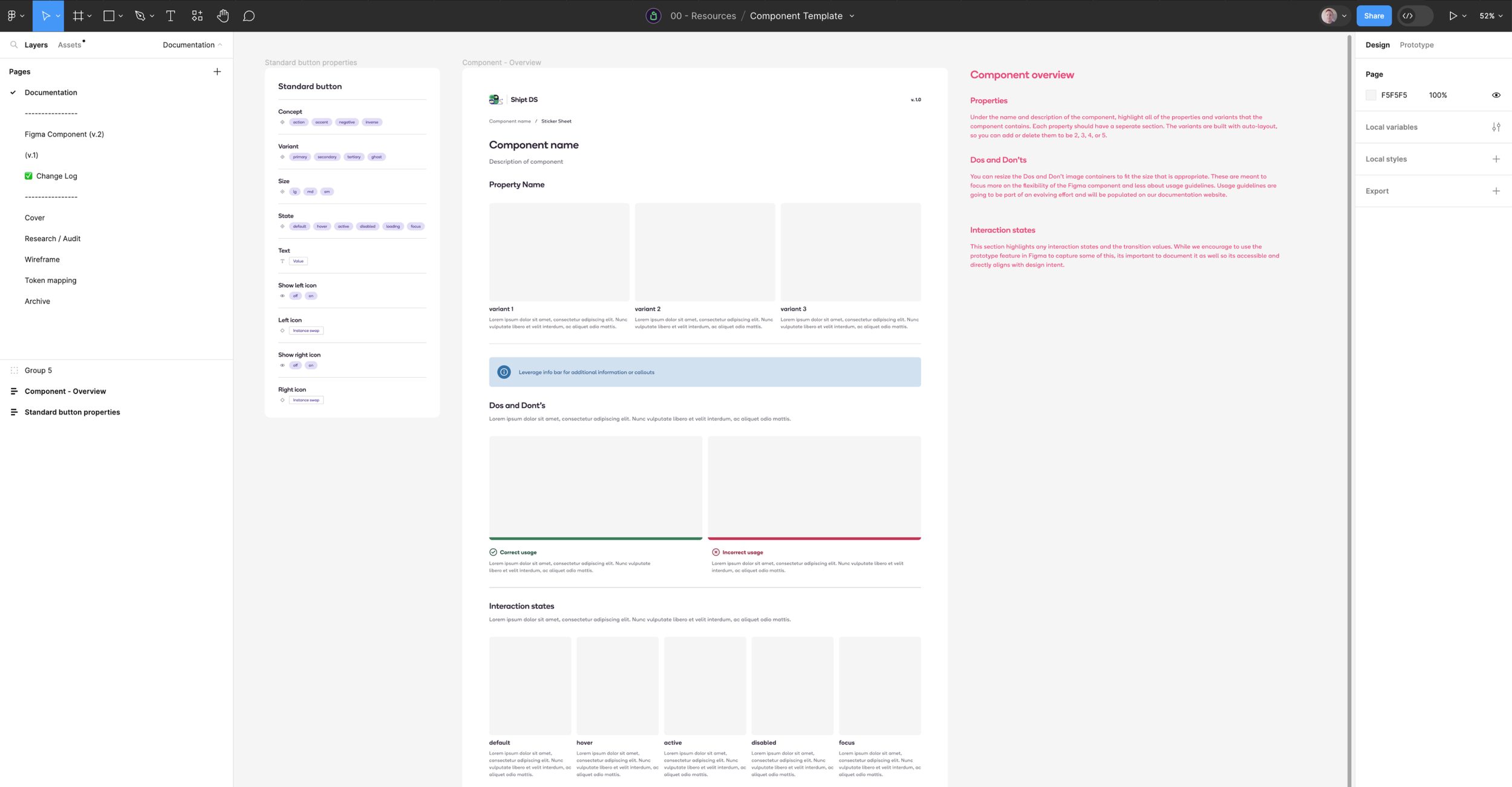
Consistent properties across design & engineering
Astro strives for parity across design and engineering tools. We apply consistent naming conventions to our components and their properties so that this is possible. Through collaboration with engineers, properties are defined and documented so that they make sense for both teams. To make this process easier, we have also collected all of our terms and compiled them inside of an internal component wiki space that is a resource for anyone to see.
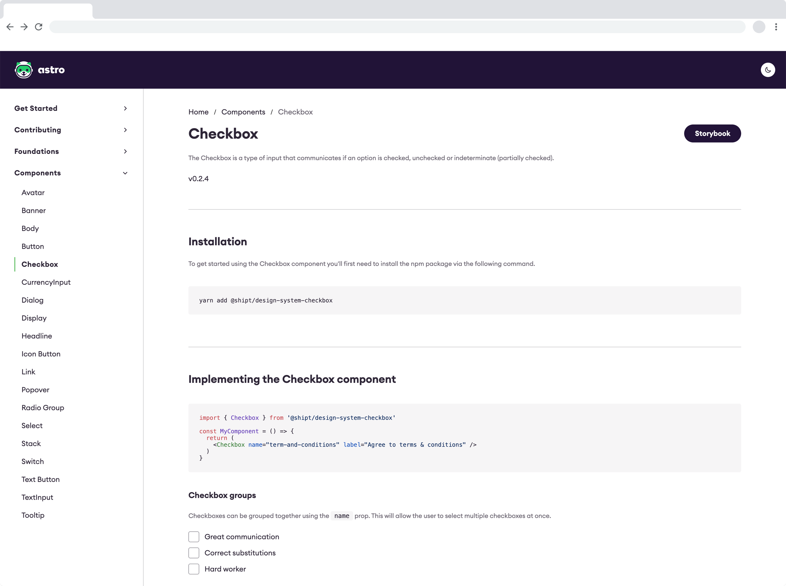
Centralizing information
Outside of the components, one of Astro’s core deliverables is our internal website. While our primary audience is design and engineers, it can be leveraged by anyone making digital products at Shipt. While our design system is an inner source model, it is still curated and maintained by a very specific group. This ensures that the information has gone through the proper methodical review process, group consensus, and is formatted consistently. Using markdown files in GitHub, there is a clear version history and ability for robust features and integrations that we would not have the option to do with a third party solution.
Measuring adoption
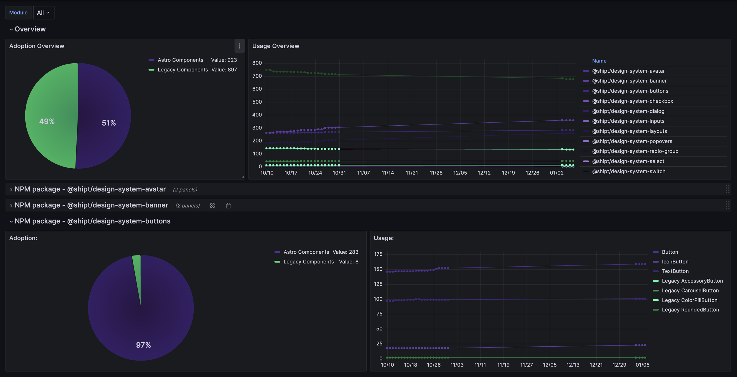
When starting out, using Figma analytics was helpful to gauge what components to prioritize based on their usage in existing libraries. This ensured that we were focusing on building the components that would have high impact. Over time, we were also able to measure library activity and detaches to gain insights into what was workings vs. not. This is extremely helpful in informing how we refine and iterate on components.
As Astro started to get into code libraries and support multiple teams, we need more. What matters is what the end user is interacting with and that means code. To gain insights, our engineers wrote a script that checks Github repositories every night for the teams that we support. This gives us visibility into how adoption is going, if we are going to make changes who needs to be informed, and helps provide data to inform OKRs that we can articulate back to our stakeholders.
Gaining sponsors and contributors
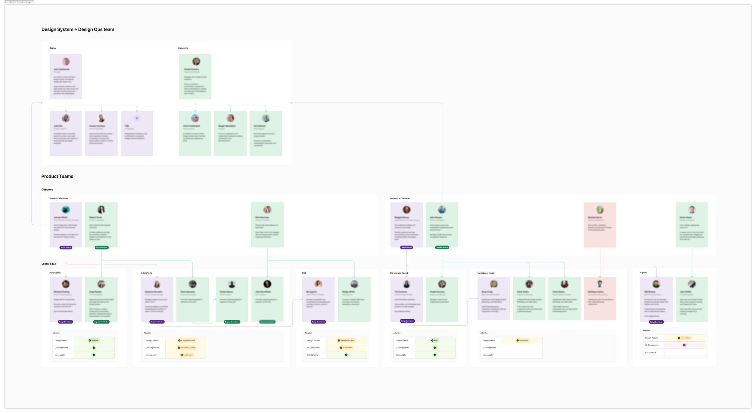
Part of design systems is the cultural changes that need to happen and how to get people behind it from both a grass roots and director level. We do that by gaining sponsors at the director level, and by creating a small group of contributors who are actively helping provide the context that the system needs and the hands to get our tasks done at times. To make our progress clear as we communicate to stakeholders, I created an org status chart.
Building on our momentum
Over time, we’ve built credibility with our stakeholders and have scaled to expand our influence into areas like content standards, brand to product handoff, and more. We currently support 3 products, but have agreement with our stakeholders to bring all of our web products into using the design system in 2024 and a plan to support our apps moving forward. Teams are working more collaboratively than ever and we’re just getting started.