Xfinity Design System
Delivering design & code
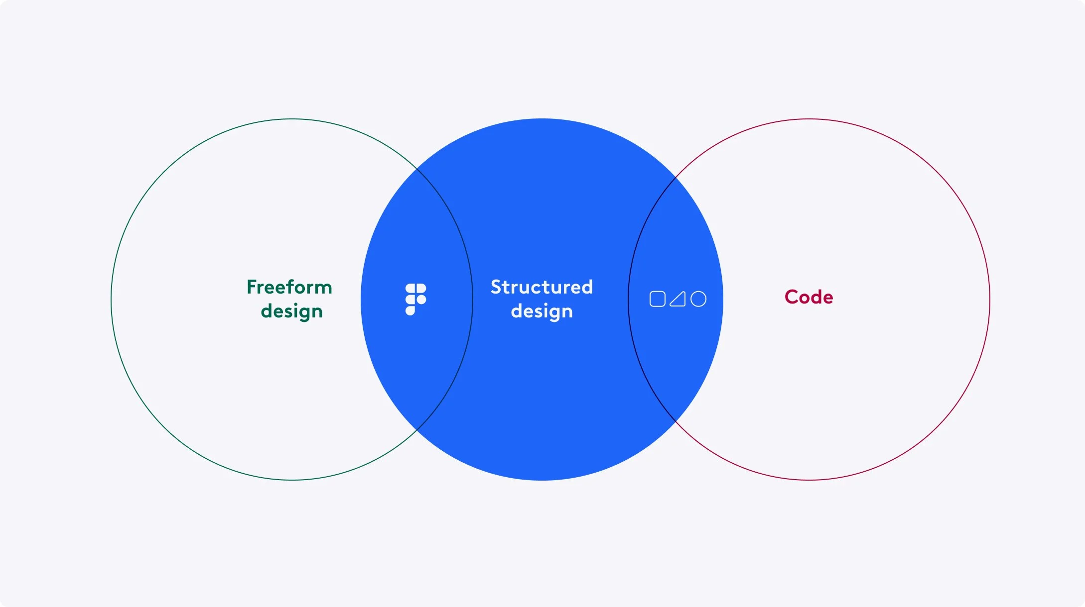
The Xfinity Design System has been a multi-year undertaking that is the coordinated collection of guidelines, assets, process, and code that together describe the experience layer of all Xfinity digital products. I founded our design system through a grass roots effort to enable a new way of delivering design and code. Connecting members across disciplines with a shared vision, we organically formed a hybrid team of design, experience engineering, and accessibility to modernize how we design and deliver digital experiences.
Identifying the need for a system
While the trend of design systems are pretty common amongst young companies, this way of working was difficult for Comcast. Before our design system was established, a lot of our feature work was done in isolation and siloed efforts and had been done this way for years. Knowing we can’t start from scratch, it was important to make the case with empathy.
Articulating the benefits
To convince leadership why the time and investment was important, the story was not to state problems, but highlight how we could achieve what we aspire to do through investing in working in a new way. I needed buy in and prioritization from design, engineering, and product so our benefits needed to be holistic and speak to everyone. To do this I conducted interviews with stakeholders and peers in companies that have had success with design systems, performed audits to have a clear snapshot of where we were, and partnered with industry experts to help synthesize the data. I then tailored presentations based on who was in the room so what mattered to them was prioritized.
Through that work, the following benefits were identified with our design system:
Platform
SYNDICATION
The XDS token framework will enable the rebrand of a product by pointing it at a new set of design tokens.
UNIQUE PLATFORM
An opinionated design system makes for opinionated products. The guidelines and solutions established by XDS will create uniquely Xfinity experiences.
PERSONALIZATION AND ACCESSIBILITY
Tokens and guidelines will inform how and where Xfinity products may be personalized at the application, view, and component level—including accessibility needs.
Quality
COHESIVE EXPERIENCE
Customers will have a consistent brand experience within Xfinity products—and a consistent interaction experience across syndicated products, too.
STEADY IMPROVEMENT
XDS will continuously refine its library of solutions, becoming ever more sturdy and reliable over time—versus solutions that are built anew with every project.
BEST PRACTICES
Guidelines and component designs will bake in best practices for UX, accessibility, performance, and code standards.
Efficiency
TIME AND MONEY SAVINGS
Reusable design tokens, components, and patterns means teams won’t have to solve problems that have already been solved—and can get to production faster.
MORE TIME TO INNOVATE
XDS will capture the “boring stuff”— the solved problems of day-to-day interactions—so teams can solve new problems instead of reinventing.
RESPONSIVE TO CHANGE The XDS token framework allows XDS to be updated quickly, with changes cascading directly to every product— allowing the brand to be responsive to expectations and trends.
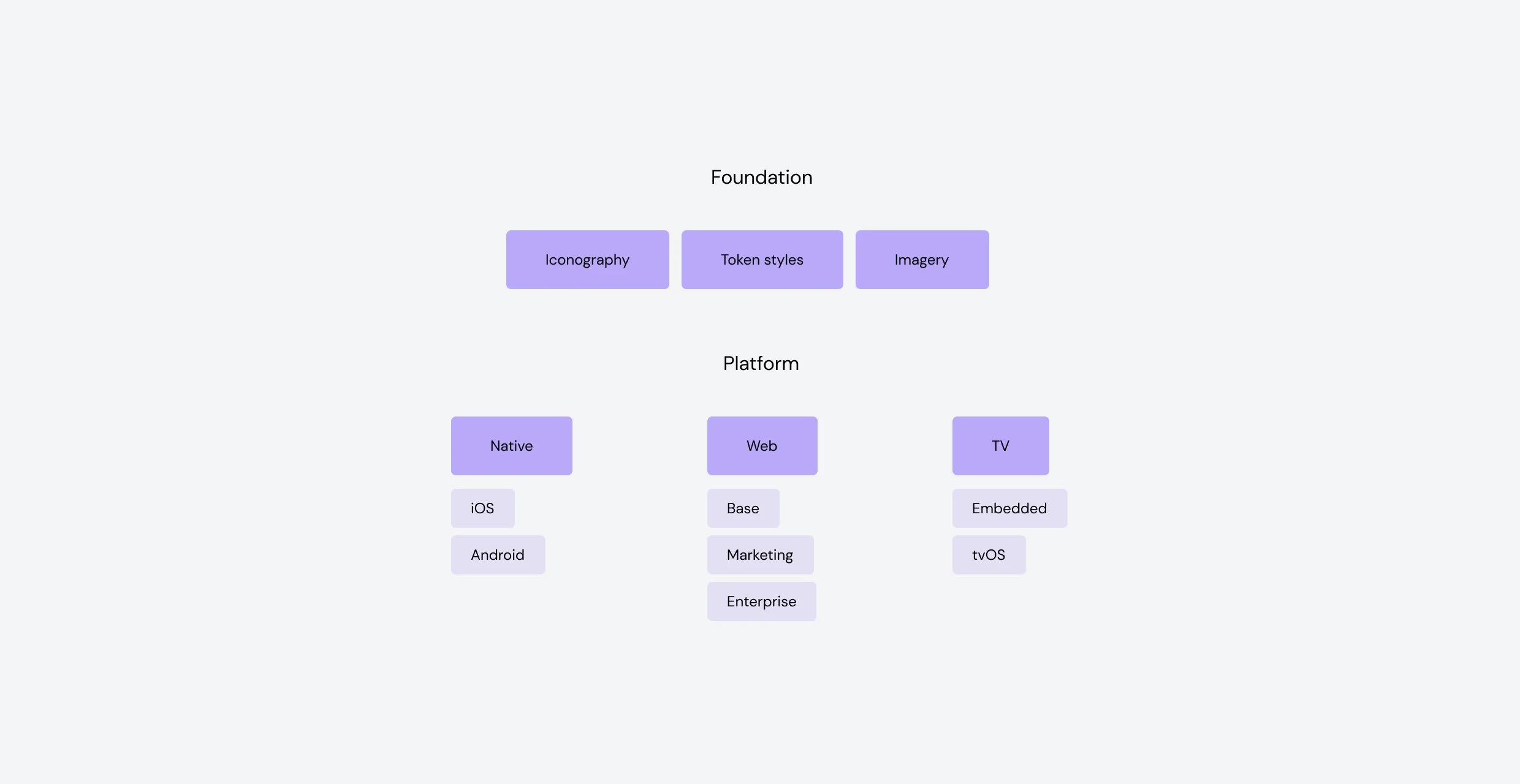
Creating our foundation
During the process, I created many connections with similar minded team members that had a desire to contribute. Now that we had leadership buy in, we needed to have a foundation to start from. With everyone’s contributions we created a tangible foundation, process, and execution strategy that bridged design and engineering with the design system in the middle.
Organization
We’ve gone through a few iterations of how we are structured. Our goal was to keep things simple, but always offer flexibility so that the system felt empowering vs. limited. Decisions cascade down so that brand styles are consistent, but afford specific nuances at the platform and even feature level. Platforms have their own UI kit and code libraries so that development hand off and culture remains intact.
Design tokens
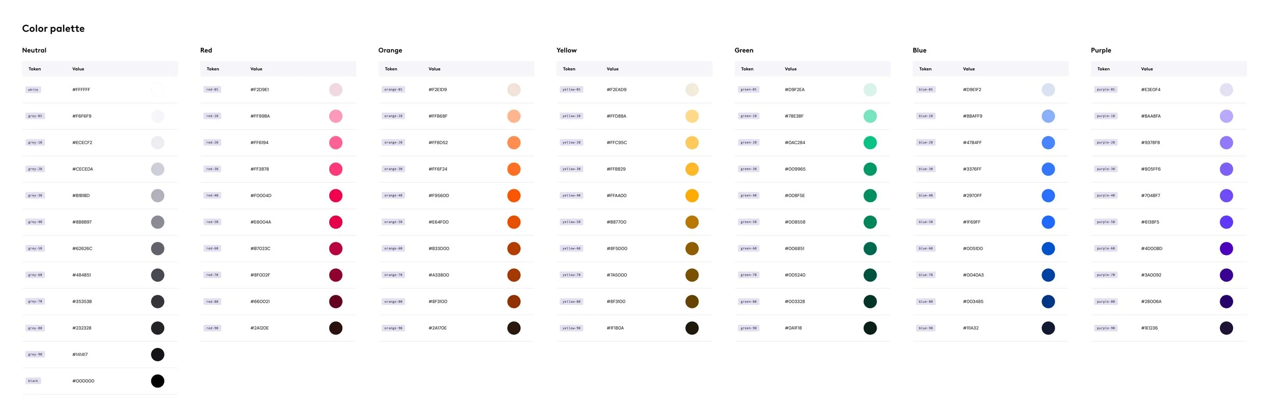
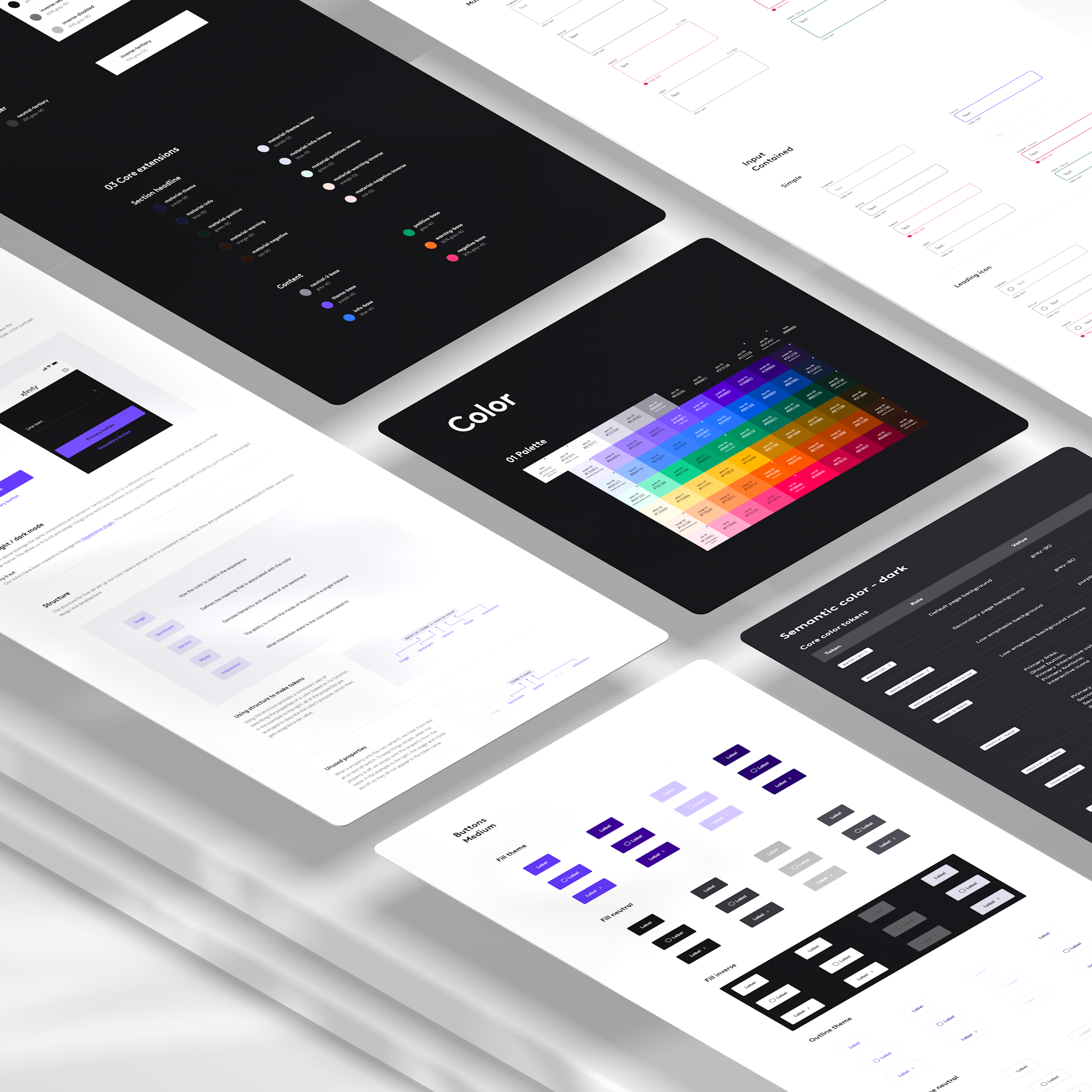
To make our cascading foundations work, there was a significant focus on design tokens. Our engineers built out a pipeline and I worked to interpret our brand decisions into a base set of tokens. Leveraging math to base decisions on, tokens are built with scales to enable them to easily adapt to context and meet requirements that our products demand.
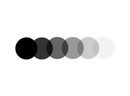
Our tokens are organized in 6 categories:
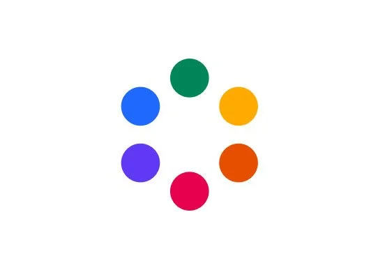
Color
Alpha
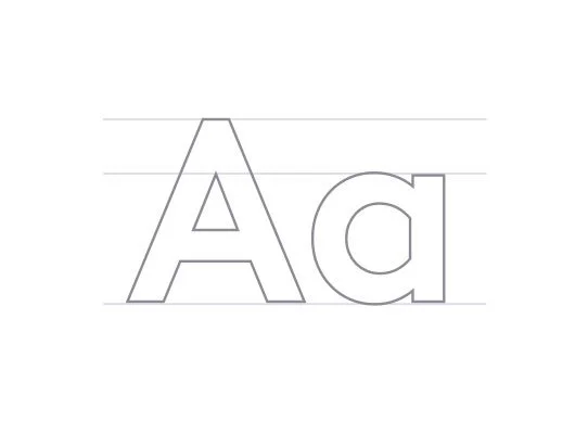
Typography

Shadow
Radius
Spacing
Semantic tokens
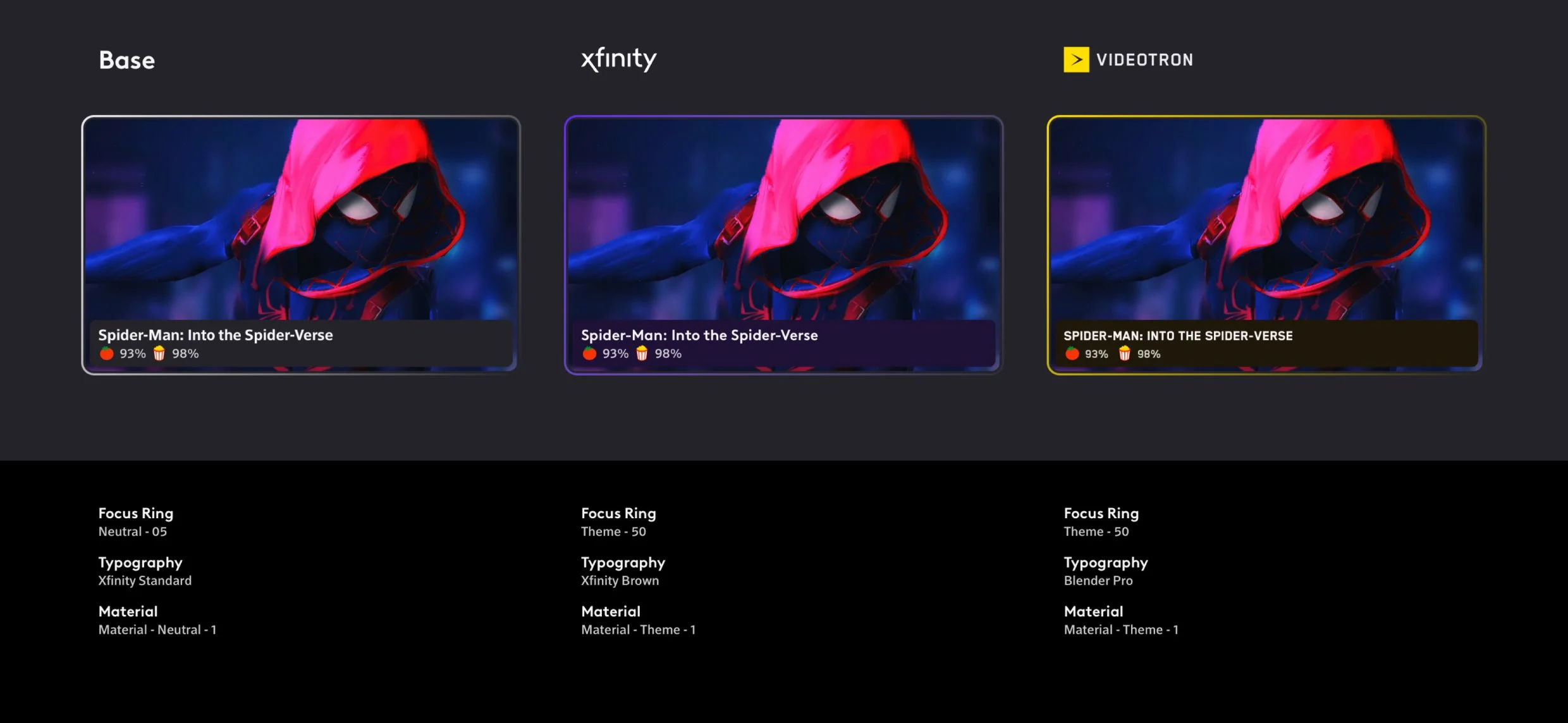
Tokens were created using a system of semantic names, which allow for scalability and flexibility. When our designs leverage our semantic colors, it opens up the possibility for easy theming for light / dark mode, syndication, and accessibility. Designs are also easier to maintain and adapt to the latest color decisions as there is a layer of abstraction between the component and the raw values it requires.
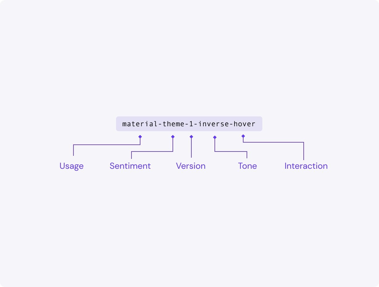
Semantic structure
I set up a structure so that tokens are consistent, predictable, and understood in their use across design and development. Using the structure provides a consistent way of describing the properties of a color based on its function. In the example, all of the properties are leveraged to describe the color’s purpose, which then gets assigned a raw value.
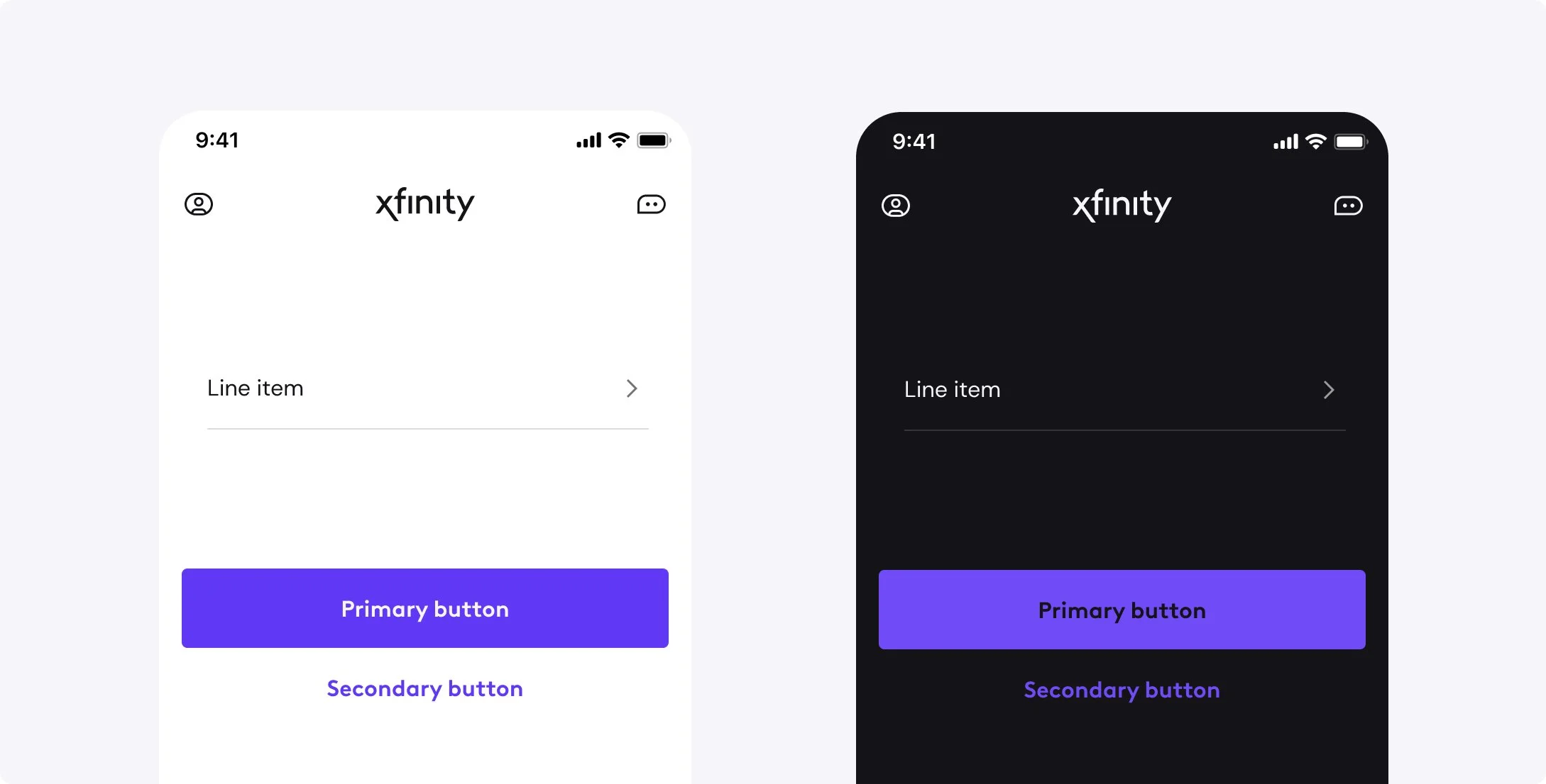
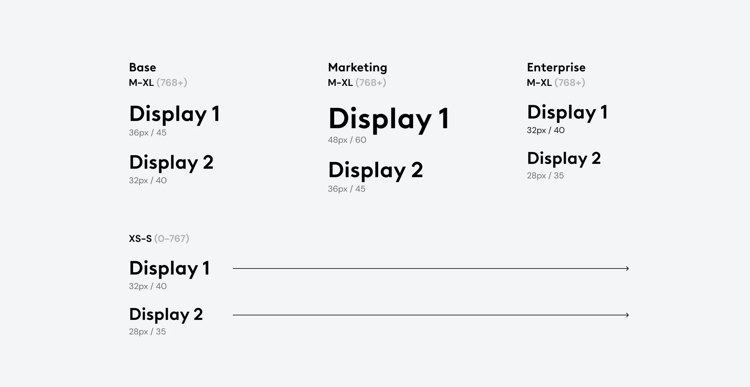
Theming
By using semantic tokens teams are able to theme their experiences and repurpose components across different use cases. As an example, I worked with teams to identify type scales that are tailored for different story telling use cases. In our marketing uses of type, the scale is larger and more expressive. Product needs are harder working use cases like viewing your account, support, and trouble shooting. In enterprise experiences, our agents require scanning a lot of data within one view so the type is compressed and dense.
Leveraging the scale, the type is able to tailor to all three of these needs, by leveraging our themes. This allows us to build items once and share them across all of our experiences while still enabling them to be tailored and appropriate in the context they are used.
Syndication with tokens
I facilitated workshops to educate working teams on how to use the system and leverage tokens to help enable more brand customization of their components for syndication. For our entertainment products, a content management system was being built so brands are able to cascade brand decisions on an experience level without significant development overhead. The design system enabled and unlocked this functionality with relative ease and provides value to what our business can offer.
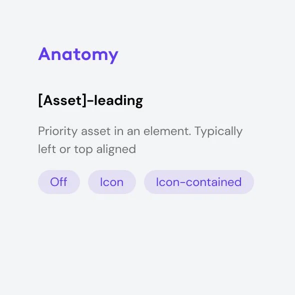
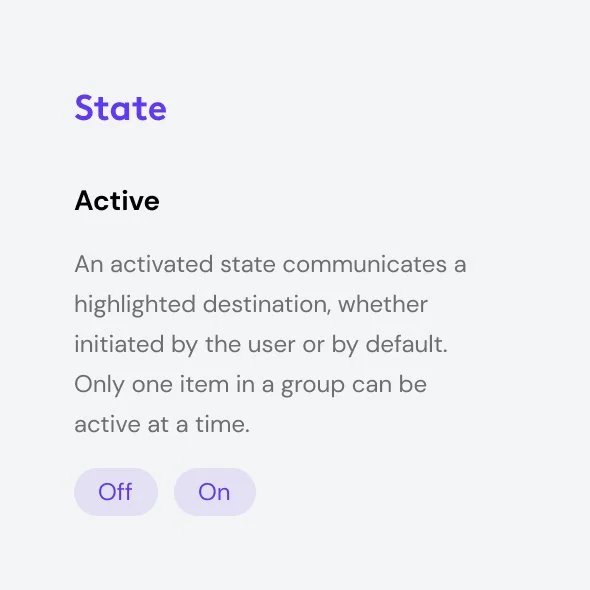
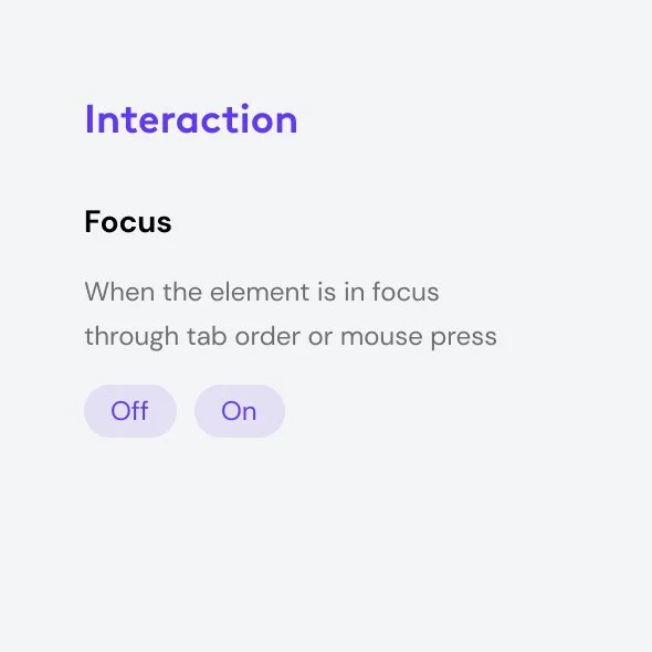
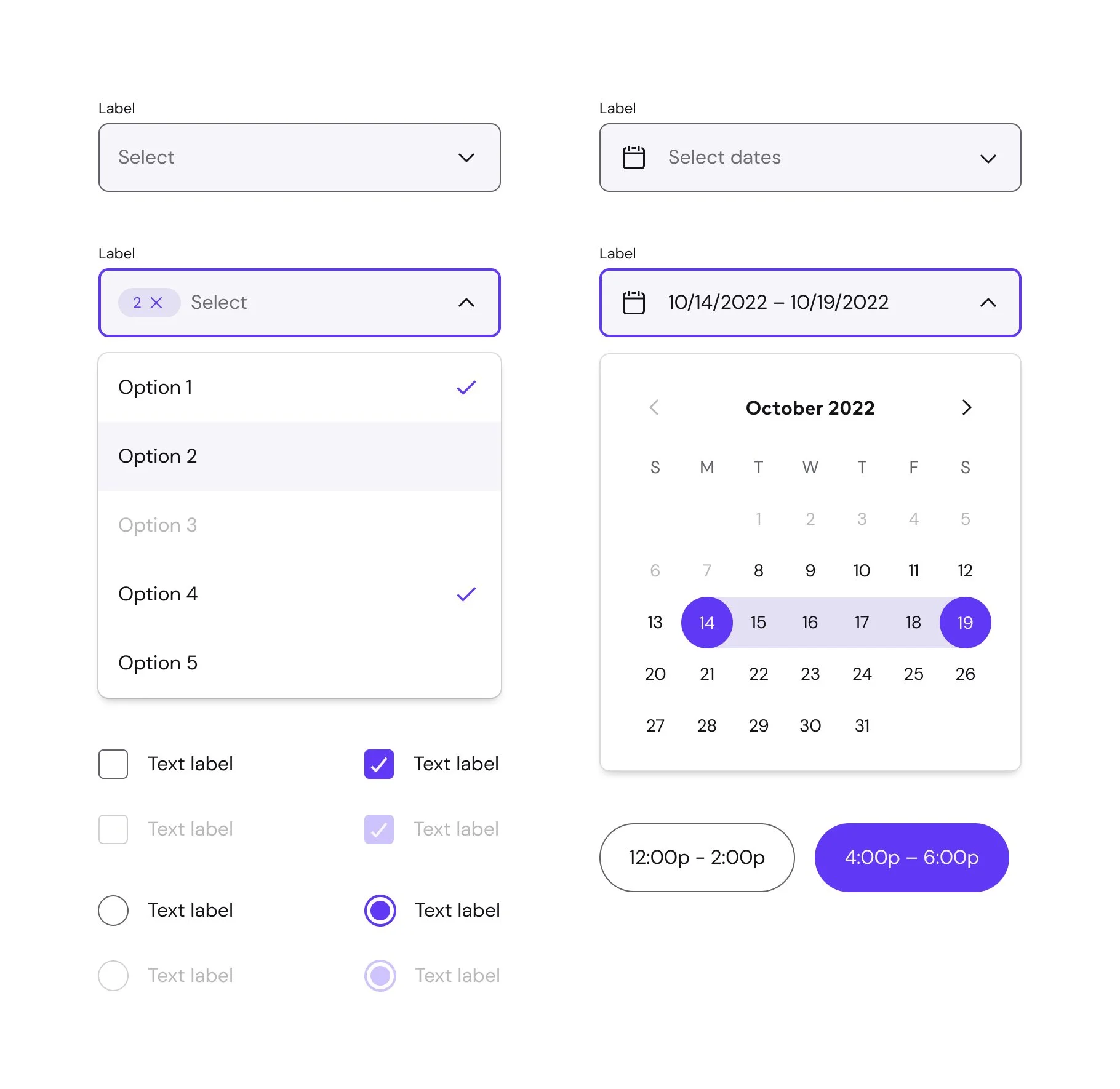
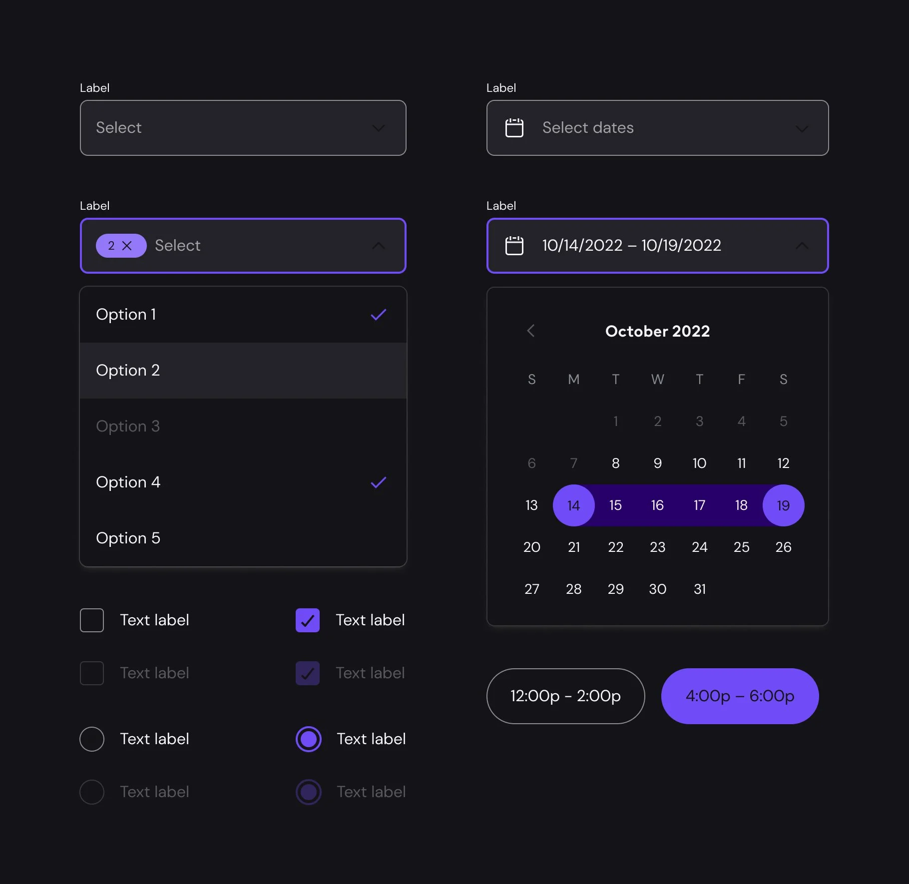
Component libraries
To help bridge the divide between design and engineering, components leverage a common set of variant and properties. Through doing audits of robust systems and collaboration with development teams, I was able to make a cheat sheet that is the foundation for every component we build. This allows our design and code libraries to have a 1:1 relationship with naming and structure as much as possible. With a structured hierarchy, tools are easy to use and predictable.