
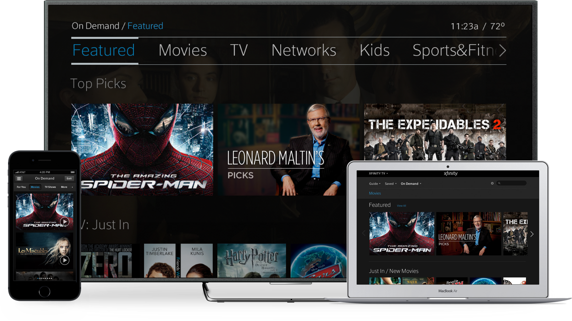
X1 Platform
Designing an entertainment an ecosystem
Comcast had spent a year and half developing technology to enable its next generation TV experience. While the technology was promising, the user experience was performing poorly in market trials. With executive pressure to start scaling X1 out to customers, I was given the opportunity to lead a team to redesign Comcast's first benchmark UI.
Getting started
The team initially started with myself, a researcher, an IA, and an interaction / motion designer. To get a better understanding of the current product, we initially spent a lot of time with product and development teams to get an understanding of the intended experience and platform. Understanding the constraints and opportunities was super important to ensure that our proposed design was attainable and didn't throw out good thinking that was lost in poor execution.
Stakeholder workshops
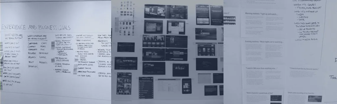
The platform had significant promise for the company and our c-level team was hyper focused on it. To help gain consensus and ensure that we were heading down the right path we facilitated workshops with stakeholders from our business, product, and technology partners. In these workshops we identified business goals and core themes that the experience could be measured against. We took over a research lab as a workshop space, so that we could leave artifacts of the process. This was helpful to highlight how the process evolved and why decisions were made.
Business Goals
The business goals were quite straight forward, but helpful in how we could measure the success of the design:
Increase consumption of Video On Demand services
Video On Demand (VOD) on the current system was very difficult to use, yet the most desirable by our business team and television networks. At the time, most customers that were time shifting television content were relying on their DVRs, which doesn't count against views or ad impressions. If we could get more users using On Demand rather the DVR, it was actually better for the business.
Reduce customer churn of existing customers
Customers were leaving Comcast. There wasn't enough of a value proposition to make customers want to pay a premium price for a subpar service. We needed to make an experience that our customers were satisfied and willing to pay for.
Increase programming opportunity
Networks were starting to make their own apps and new avenues to extend their narratives into new domains. The business team was looking for a way that we could make unique opportunities in the experience to promote or extend their content.
Based on the workshops that we facilitated, we were able to take the thoughts and distill them down into a definition that captured the core ideas that were shared.
A personalized, multi-device entertainment product line that delivers:
- any content customers want (video, music, games, 3rd party apps)
- a tailored experience that follow users to the screen of their choice
- fully integrated premium, standard and mobile app remote controls
- scalability to accommodate new content, sources, and apps
- dependable, reliable performance
- consistent relevance
- universal access
to:
- anticipate customer needs so the platform will "do it for me"
- support TV-viewing routines and behavior while enabling serendipity
- build trust and confidence
so that customers will:
- consume more content
- see more value
- have a stronger, longer-lasting relationship with XFINITY
Design Audit
We did a high pass audit of X1 to get a better sense of what was and wasn't working. The initial strategy was to try to work within the existing framework to see if we could incrementally make updates to improve the overall UI. In conducting usability and heuristic studies, we found the following fundamental issues:
Poor Interaction Design
The interface was laid out based on 3 columns that stack horizontally, but had nested horizontal content that made traversing the columns difficult. In some areas of the experience, it could take up to 6 presses to get to where the user was intending to go. As the user moves across stacks, they slide to reveal new stacks. This pattern was used over and over again, which made an endless loop that was extremely disorienting.
More Chrome then Content
TV should feel as rich and premium. The UI had more attention to detail to its chrome than the content in which it housed. The ratio balance seemed way off, and made finding content difficult and the interface compressed.
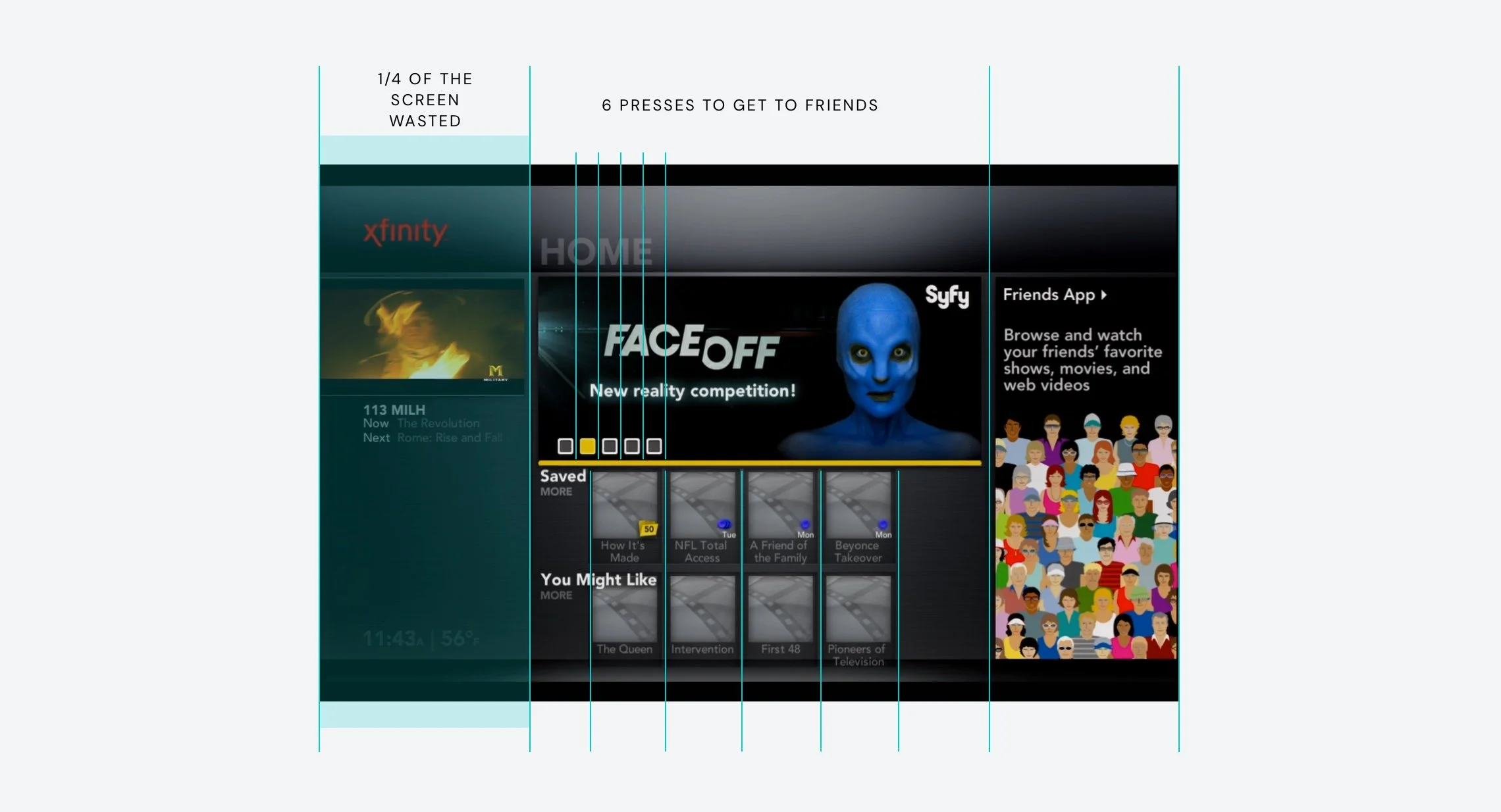
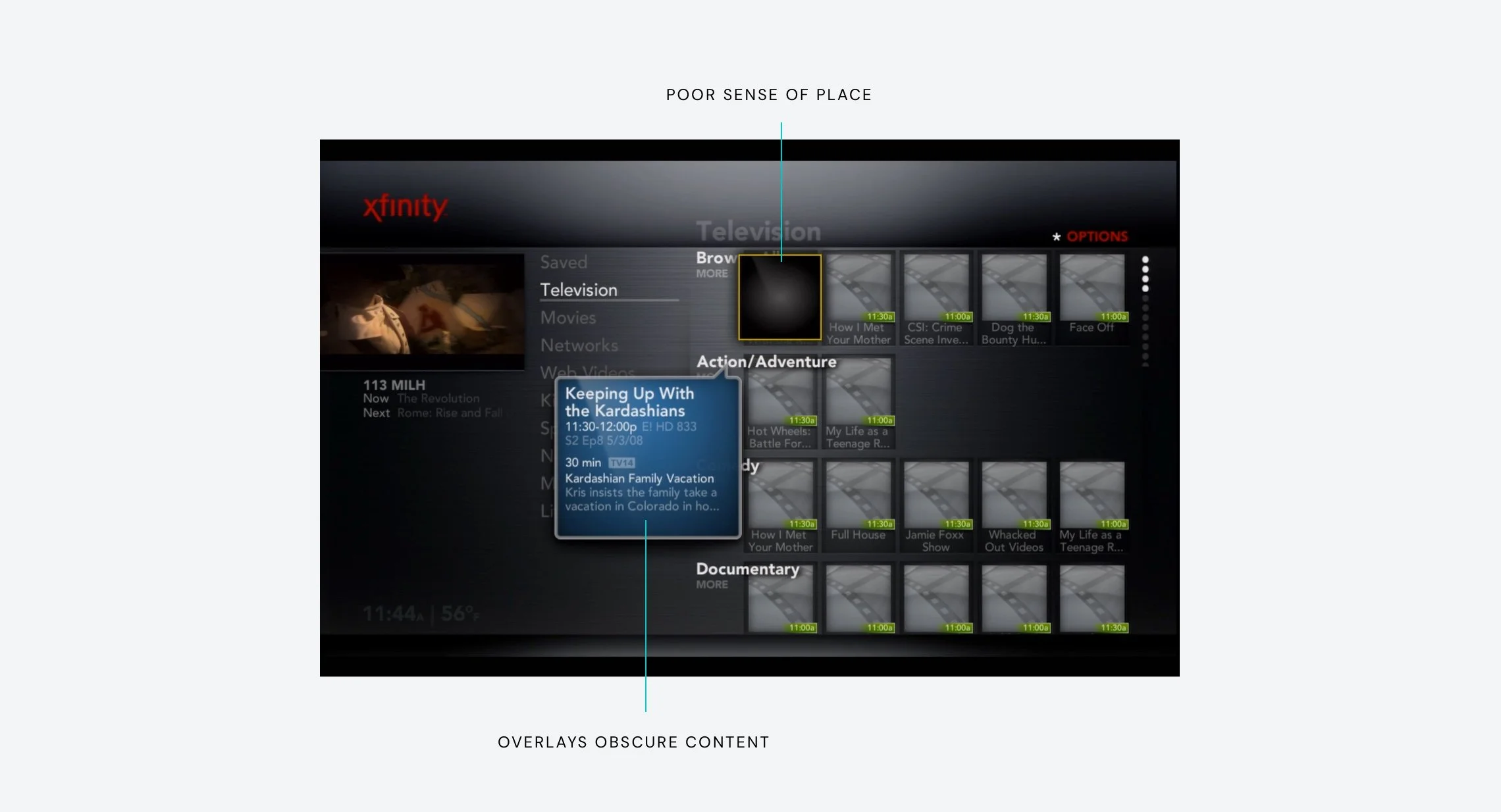
Poor Sense of Place
The UI had secondary highlight states that caused user confusion in what they are highlighted on. The screen was dense and titles overlaid the content which compounded the problem even more.
Overlays Obscured Content
Meta-data wasn't a consideration with the foundation of the interface. In order to showcase meta-data to the user, an overlay would appear that would obscure content that surrounded it. This is extremely problematic when attempting to use the screen for visual cues on where to go.
Incremental Update
With the original intent of incremental updates, the UI could only go so far. Leveraging design aesthetic from our mobile experiences, we designed within the framework to see if updating the front end could help. While there were minor improvements made to the interface, it still didn't solve the root of the problem and the goals of the business.

Redesign
Understanding the one of the majors flaws of the current system was that there were no foundational principles that guided decision making when it came to the design, I thought it was important to have those set so we could be as disciplined as possible. Before starting, I came up with a few principles that could help guide the team.
Edge to Edge
A TV interface is a window that looks onto a canvas. By allowing items to extend beyond the canvas it opens the interface up while also giving the user cues towards how to interact with overflow of content. While safety margins are important, we want the experience to always feel full.
Less is More
While a TV is a large screen, most people are sitting about 10 feet away from it. Employ a rule of 6 items or less so that the interface has air. Having less on the screen allows those items to be bigger and more beautiful.
Use the Axis Purposefully
Use the X and Y axis in a very disciplined and purposeful way. The user should never have to zigzag to get to what they are looking to do. The interface must maintain clean rows and columns so that the user is only a few presses away and understands what the direction means.
Progressive Disclosure
Reveal interactions and content as a user interacts and expresses interest. This allows the screen to remain simple and only presents content to the user that they actually care about.
Be Consistent
Keep actions, directions, interactions, and regions consistent across the experience. Designs should always keep what's important in a consistent region of the screen. In the primary UI that is the upper left and when sharing with video it is the lower third. This allows the user to always have a sense of place as they interact with the UI.
Content is the Hero
Keep content the hero of the experience. Design for design should be avoided. Always make the content as big and focused as possible
Design Sprints
To make designing the experience easier, we broke our concepts down into themes that we could create a sprint around. We would concept, prototype, and test ideas in one of the themes every month and then relay back our findings to the executive team in the next team workshop.
Start and Personalization
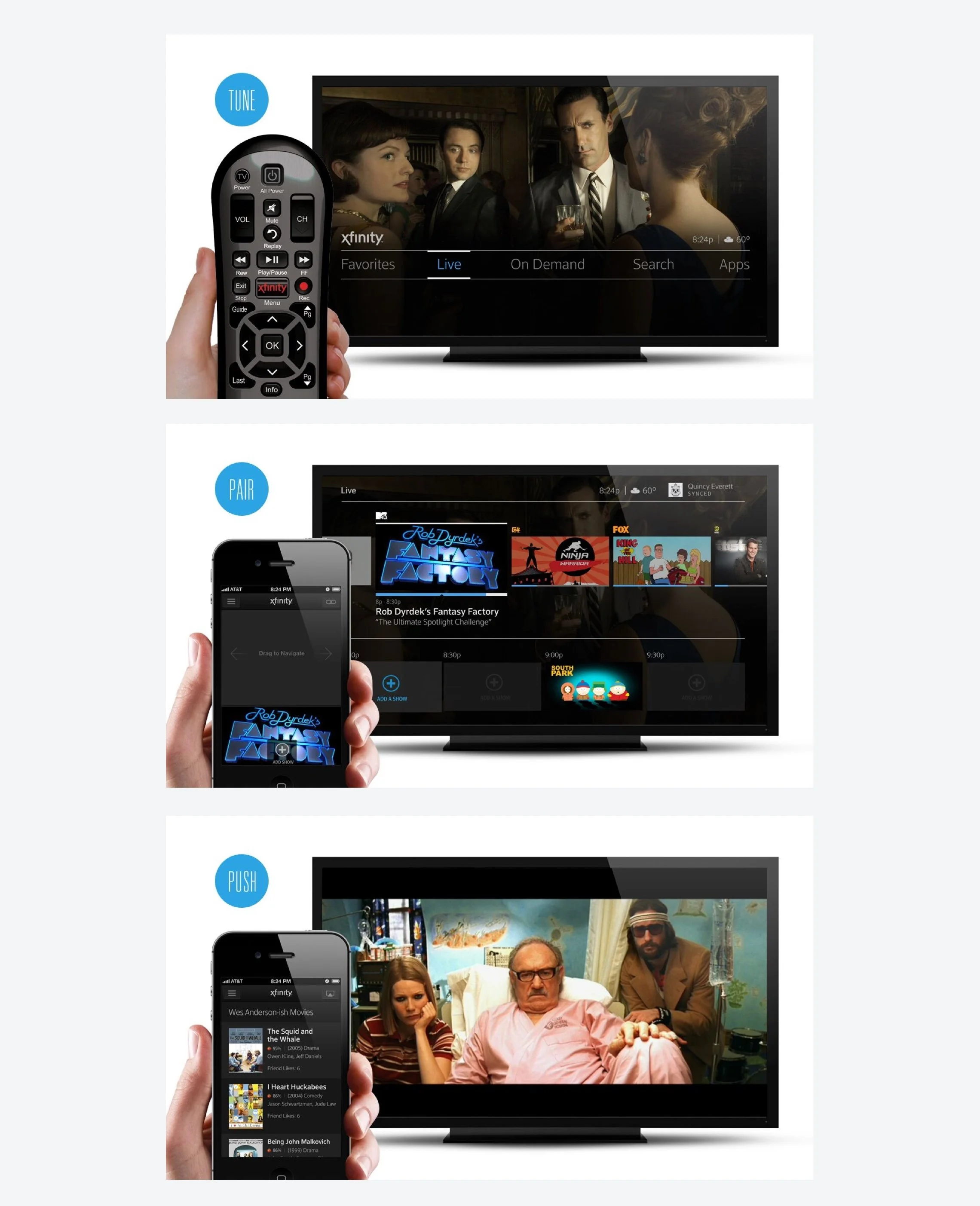
Our first sprint focused on a high level interaction framework. Based on that framework we stress tested it out with how personalization might work in the interface. The TV is often used as a communal device, so we thought of various ways of active and passive personalization through the use of a remote and personal mobile device.
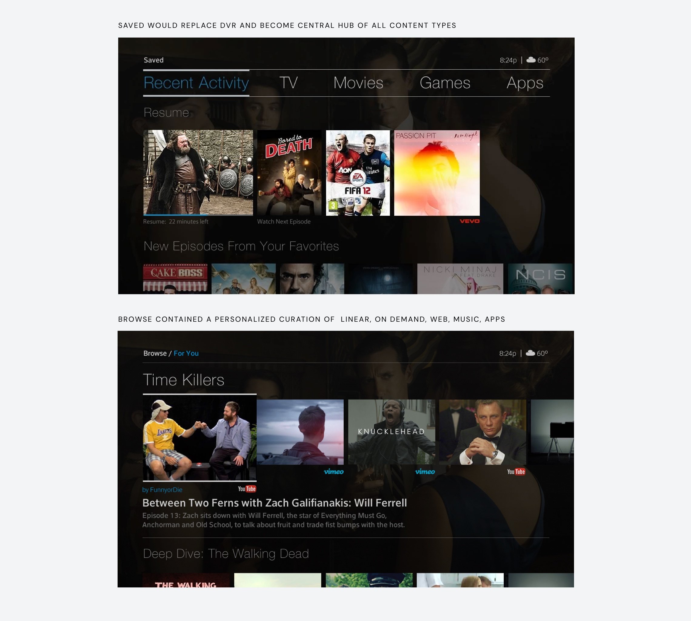
Blended Content
The second core theme was to explore how different content types might work within an architecture. Previously, the interface was geared around traditional IA which included Guide, On Demand and DVR. The new proposal would focus more on the notion of what I want or help me find something new regardless of the content type.
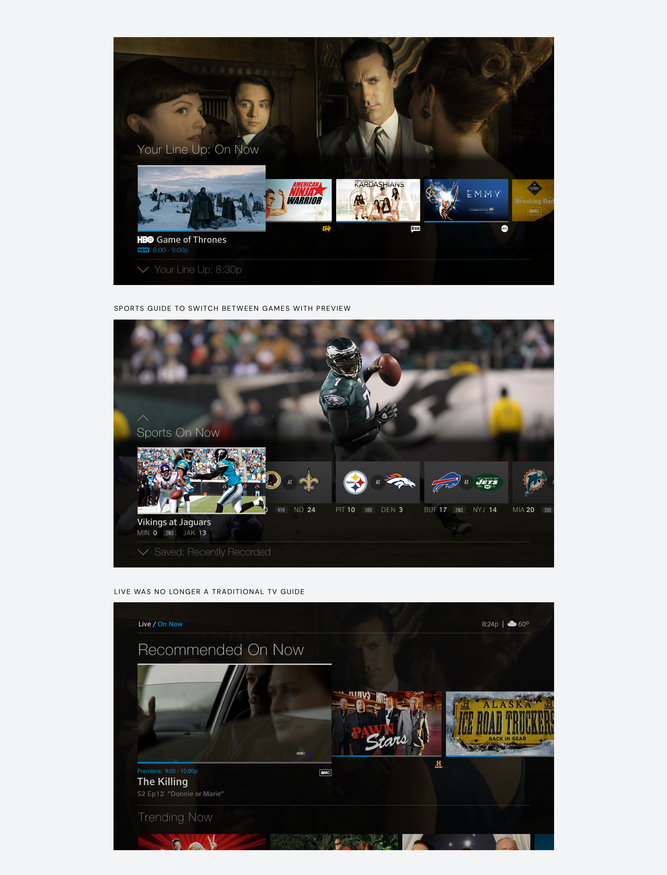
Live
Live TV is one of the core differentiators of traditional cable vs. other over the top services. It seemed important to not forget this idea, so our third theme became an exploration on the traditional guide and new ways of exploring live content.
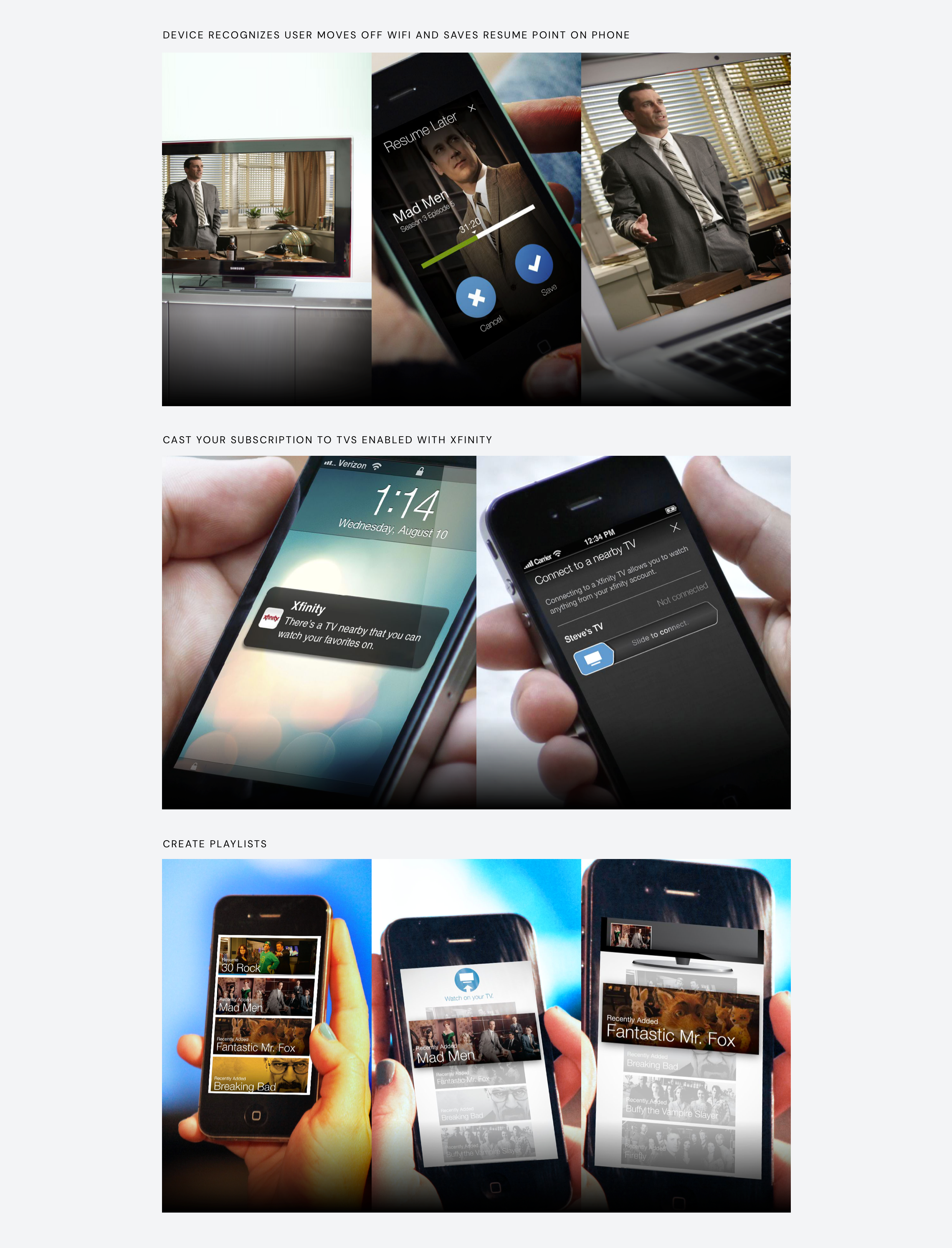
Multiplatform
One of the most important aspects of designing our system, was that we wanted it to be designed holistically across different platforms. We pushed that each platform had something unique that provided different use cases, opportunities, and constraints. We worked with frog design to explore use cases that highlighted the potential of what mobile devices could offer the service.
Build out
After 5 months of getting buy in, the executive team gave the go ahead to move the project into production. From there the team was built up to support it from product, development, and design. My team grew to a 10 person design team that was focused on working through our designs across television, mobile, and web.
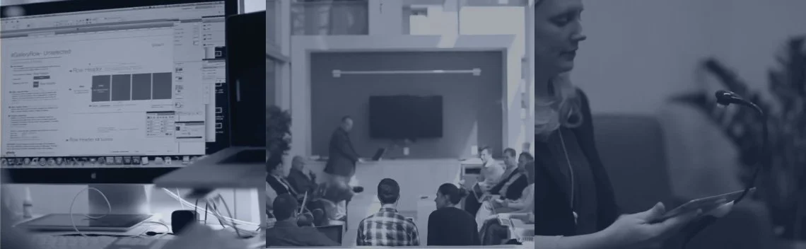
Collaborating
Working with a team of visual designers from multiple platforms; we worked through a design documentation and logic that mapped towards how the engineers were proposing to build the system. We devised a standard grid and increment system that would allow us to document it once globally and have it then work within each prospective platform. Every week we co-located with stakeholders from product, development and design to walk through decisions, research, and status on a unified front.
Release
In less then a year after getting buy in from the executive team, we released X1 Platform to Comcast's footprint across television, mobile, and web. For the first time ever, all of Comcast products had the same design approach. There are too many details and features that were involved to capture, but below is a video that summarizes X1.