Xfinity Rewards
A loyalty program crafted to express appreciation
The customer experience team had received executive buy in to create a loyalty program for Xfinity customers. The program was moving into its next phase of execution: a more defined user experience that would go through testing with the intent on officially launching the program. I was asked to work with our product design team to align it with our rebrand and updated user interface.
Xfinity Rewards framework
The initial sprints were focused in on the answering what the high level framework of the Xfinity rewards program was. Once that was solved, we could push these decisions through a customer journey. The program framework focused on two core components.
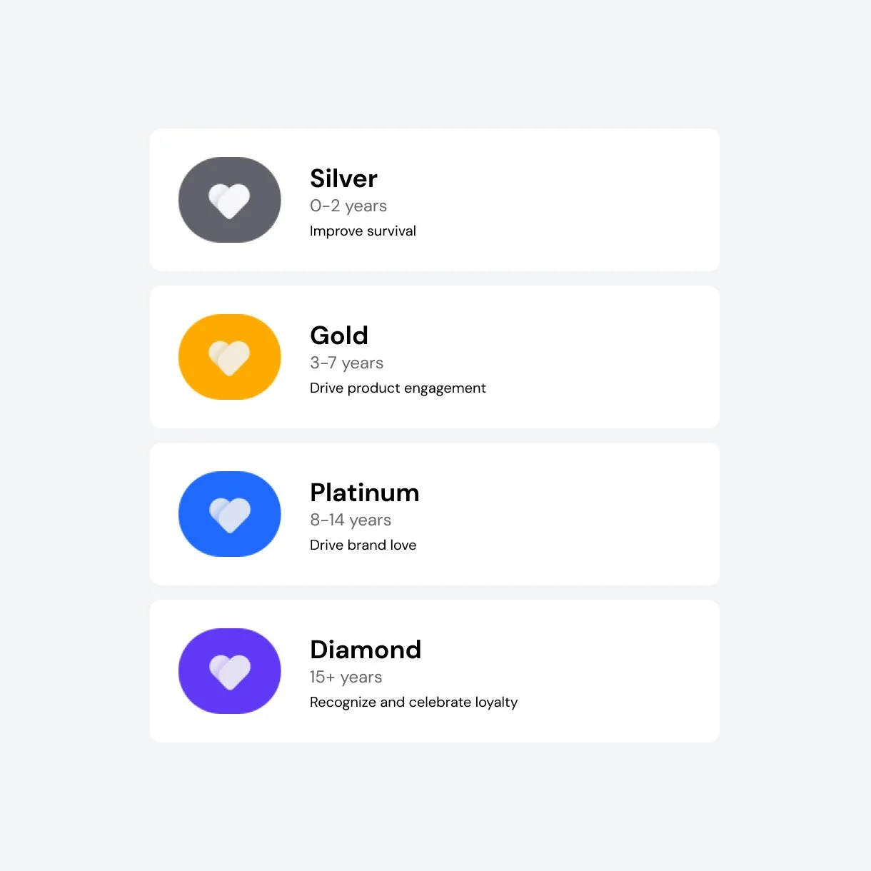
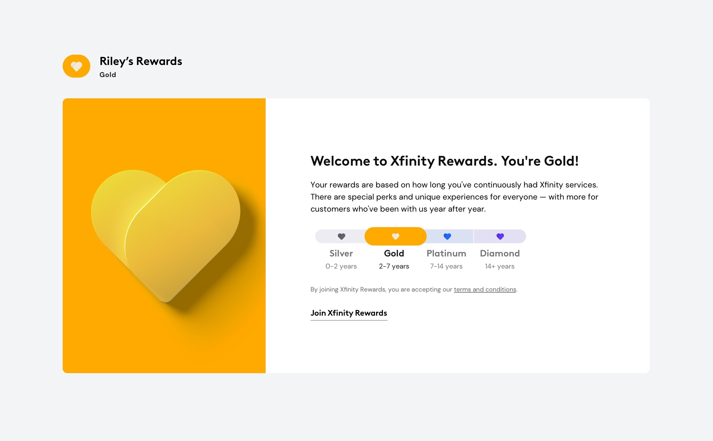
Status
Rewards are unlocked within a tier system based on their tenure with Xfinity. Research was conducted on different tier systems and metaphors to make them relatable. That research concluded precious metals were the most understood and represented the tier structure most clearly.
Rewards
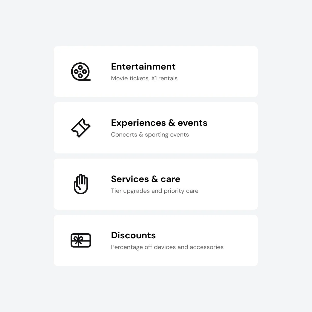
The rewards program takes advantage of Comcast NBC Universal’s diverse portfolio and offerings. It provides a range from small gestures like discounts on content and free services to experiences like concerts, sporting events, and theme parks.
The customer journey
When defining the experience for Xfinity Rewards, it was broken down into three core areas across the customer journey. These areas were used to inform decisions on where to take cues for brand / UI decisions.
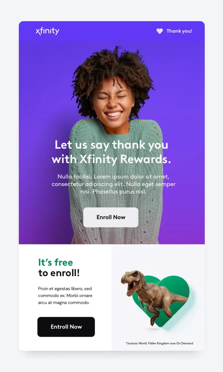
Learn
Educate what the program is to inform the enrollment decision.
Join
A frictionless sign up experience to enroll in the rewards program.
Enjoy
The member experience to discover and redeem rewards and their status.

Xfinity Rewards brand
Xfinity Rewards is all about showing our customers how much we love them. We represent that symbolically through the heart. The challenge was how we can make it feel unique, but aligned with the new master brand. Our new brand leverages shape, color, and light so I applied these ideas to our heart in a material and light study, which informed our final deliverable.
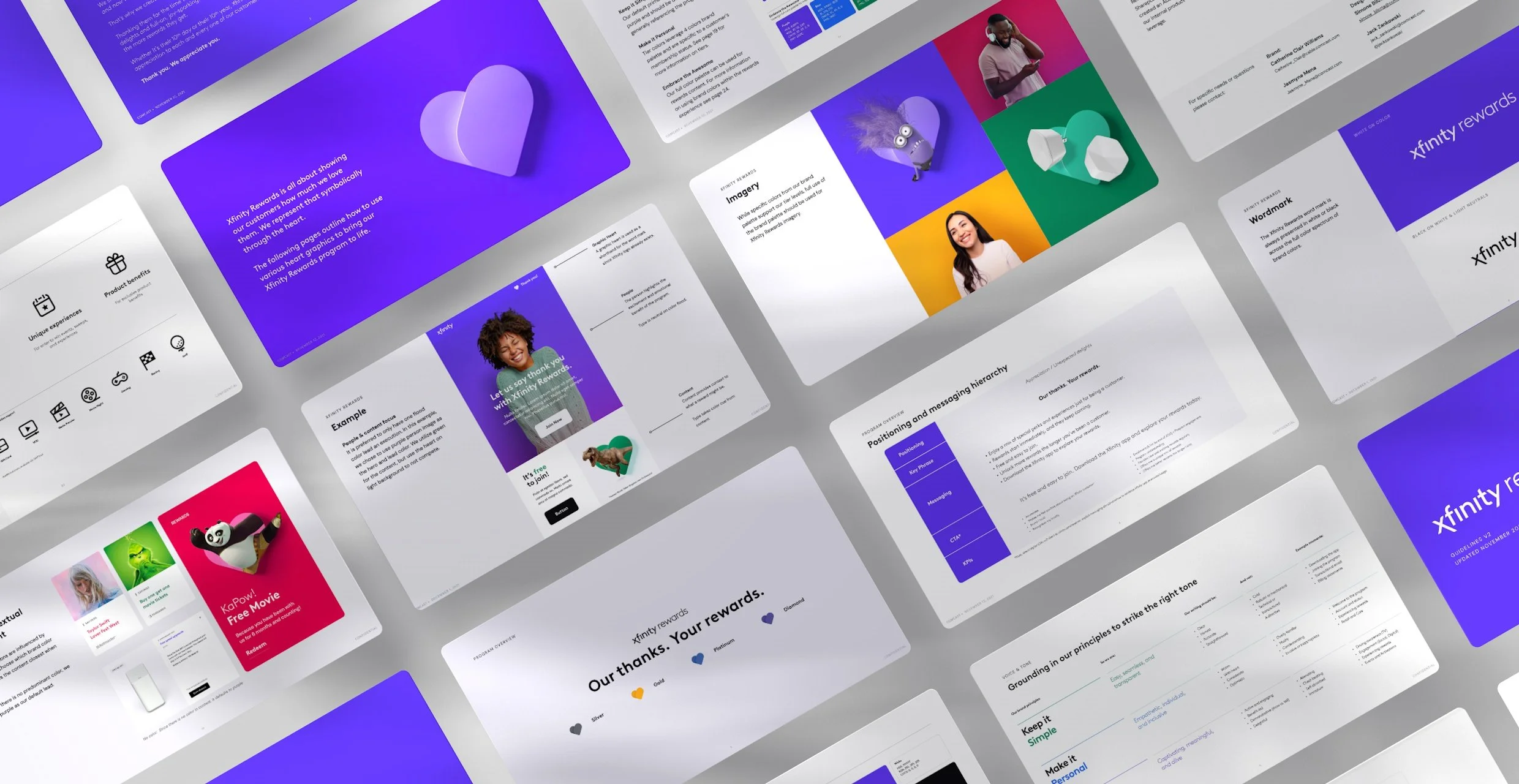
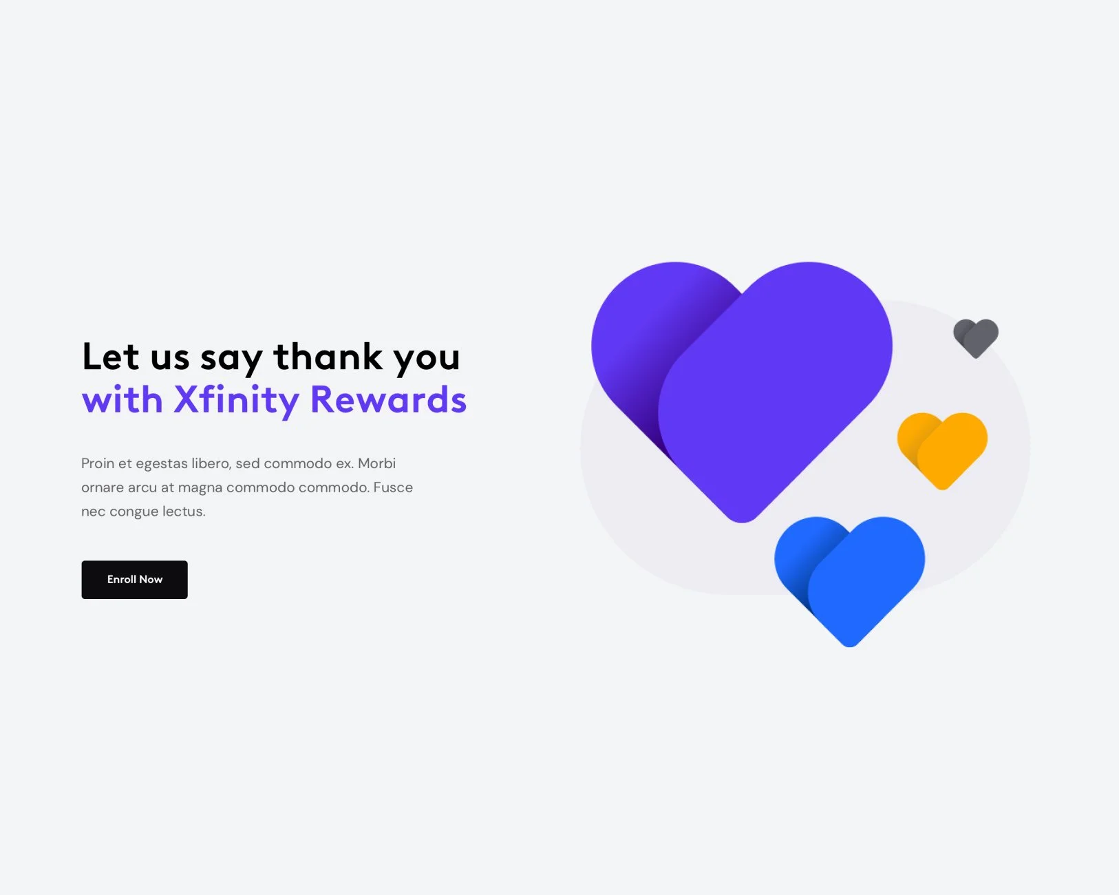
Tier Hearts
Once the general aesthetic of the heart was defined as the lead element, we then applied a high level idea across the customer journey. Based on the various needs, we then broke the heart into a primary and secondary to be leveraged in hero moments to harder working use cases.

Primary
Used for excite moments specific to tier, such as welcome, tier bumps, benefits, etc. and was created for full flood or light backgrounds. These hearts were rendered in a 3D environment to take advantage of lighting and global illumination.

Secondary
Only to be used when visualizing customer’s tier in a small space, such as account profile lockups or when tiers are visualized in a row. Meant for smaller spaces and low file size, these were crafted using vectors, have exaggerated curves, and higher contrast.
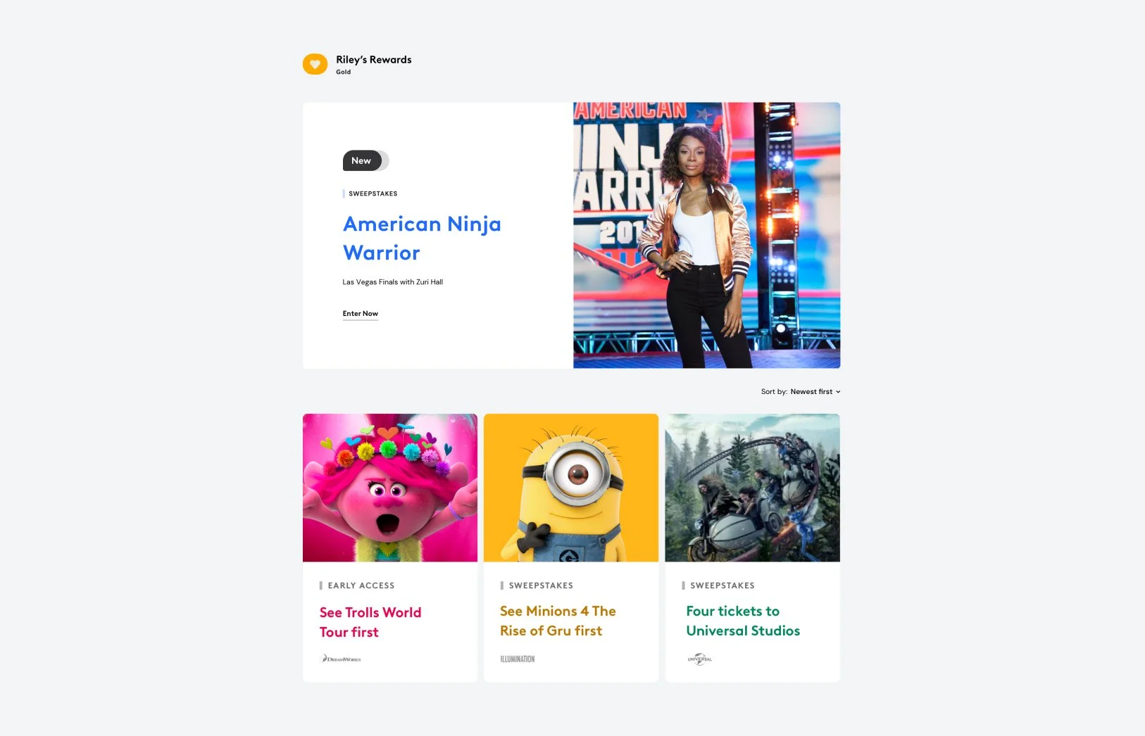
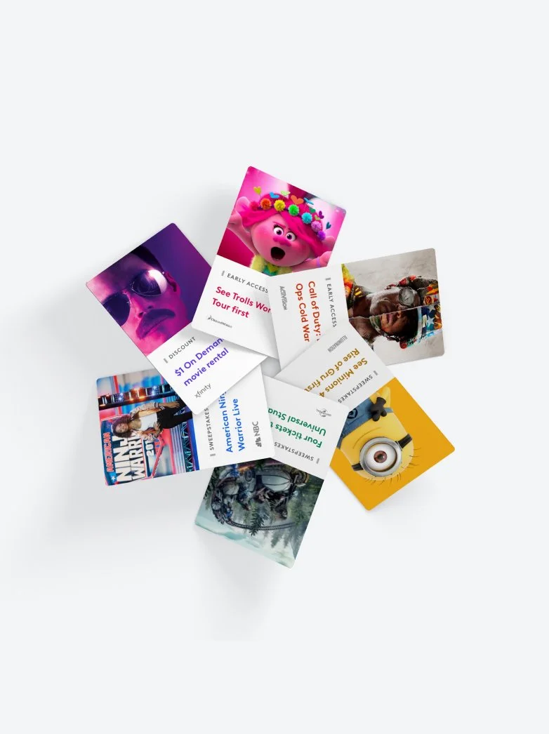
Rewards card system
We draw customers in through highlighting actual rewards and by showing the emotional benefits. The rewards imagery is either highly customized through an editorial team or dynamically brought in through a third party API. To standardize presentation, I created a responsive card system and employ an empathy approach to color so that it feels cohesive. To help visualize and make decisions, I made tools to allow teams to quickly preview how the images will render inside of cards. This was also helpful in giving partners an idea of how their content will appear in the experience.