Xfinity Assistant 3.0
Rebranding Xfinity Assistant
Xfinity Assistant was originally launched by our customer experience team to help facilitate troubleshooting. The experience was very utilitarian and lacked any connection to the Xfinity brand. As design director, I was asked to help work with the team on their redesign with the main objective of making it feel more connected to the brand.
Rebranding the assistant
The initial design explorations were spent were spent on how we could bring more life to the assistant and tackling how we could make interactions feel more branded. Prior to the exercise, our voice interface and the assistant were treated as two discrete experiences. The design sprint focused on how to blend these together.

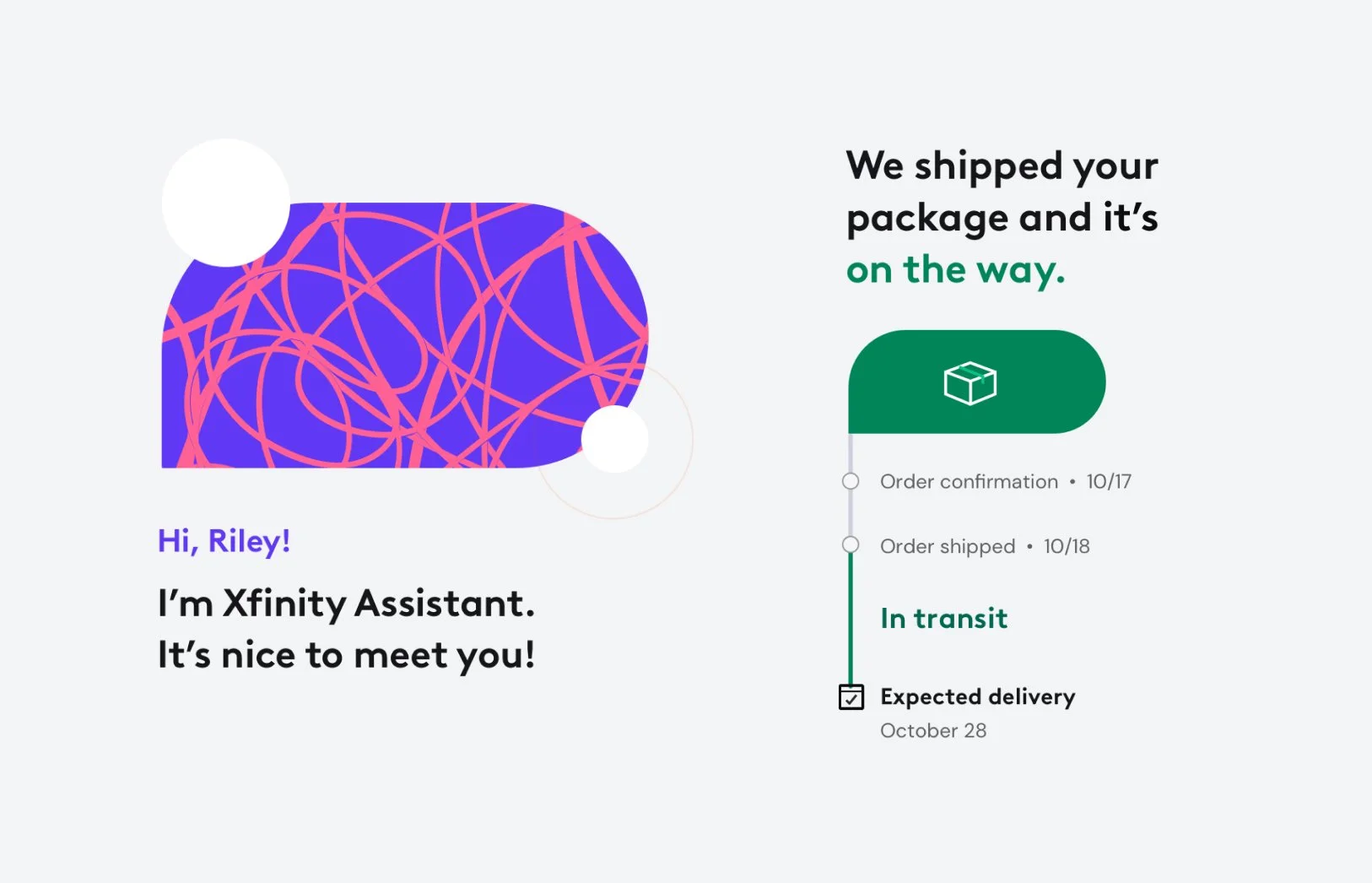
Avatar
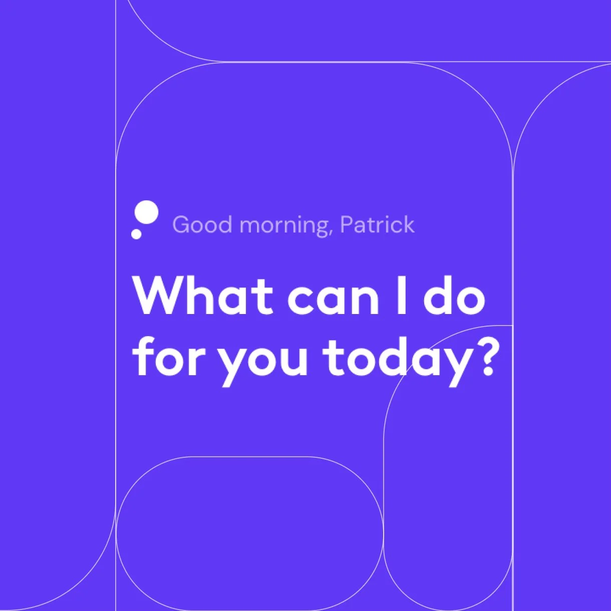
The avatar should bring life to the assistant. Prior work left the avatar static and was lacking any expression. We wanted to look at how to transform it into a living mark.

Input modality
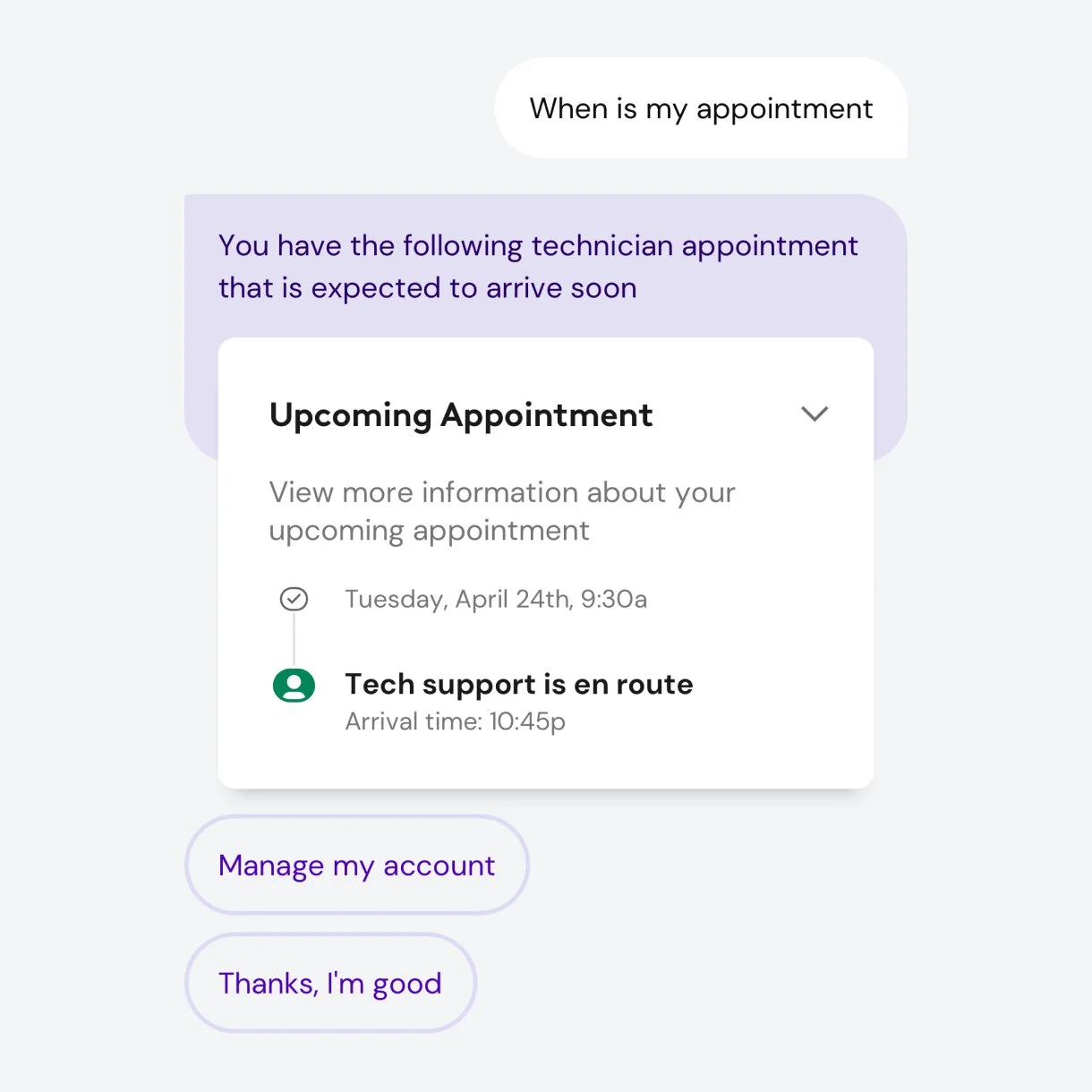
The voice and chat experiences were designed discretely and didn’t work holistically together. We wanted to think of voice or text as input modes to communicating with the same AI.
Avatar study
The avatar is the life of the assistant and had the opportunity to be more expressive and be more connected to the brand. The assignment was to retain as much of the equity of what the team had already invested in, but bring it closer to the rebrand. To do that I took the existing avatar mark and simplified it to follow the rebrand form language. I also thought of the mark as layered and independent pieces. This informs how it behaves and moves. This allows the avatar to be simple, but also transform itself to tell more complex information.

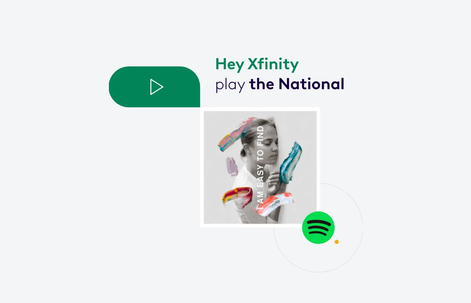

Input modality
With varying contexts, the ability to interact with the assistant could be through text or through voice. I wanted the ability to switch between those modes to be accessible and present proper feedback to the user in an elegant way.
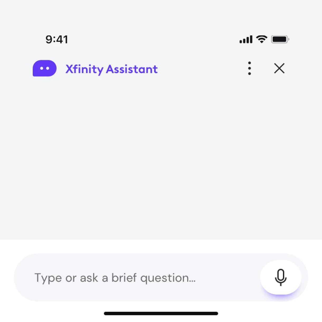
Typing
When a user taps into the input field the mode moves into text input. The UI takes advantage of native keyboard controls and the microphone is replaced with the send icon.
Voice
When a user taps on the microphone icon, the mode moves into voice input. Feedback is depicted through a horizon line with soft color spills. The dynamic animation has 3 soft shapes that have their height and width manipulated by specific frequency and decibel ranges.
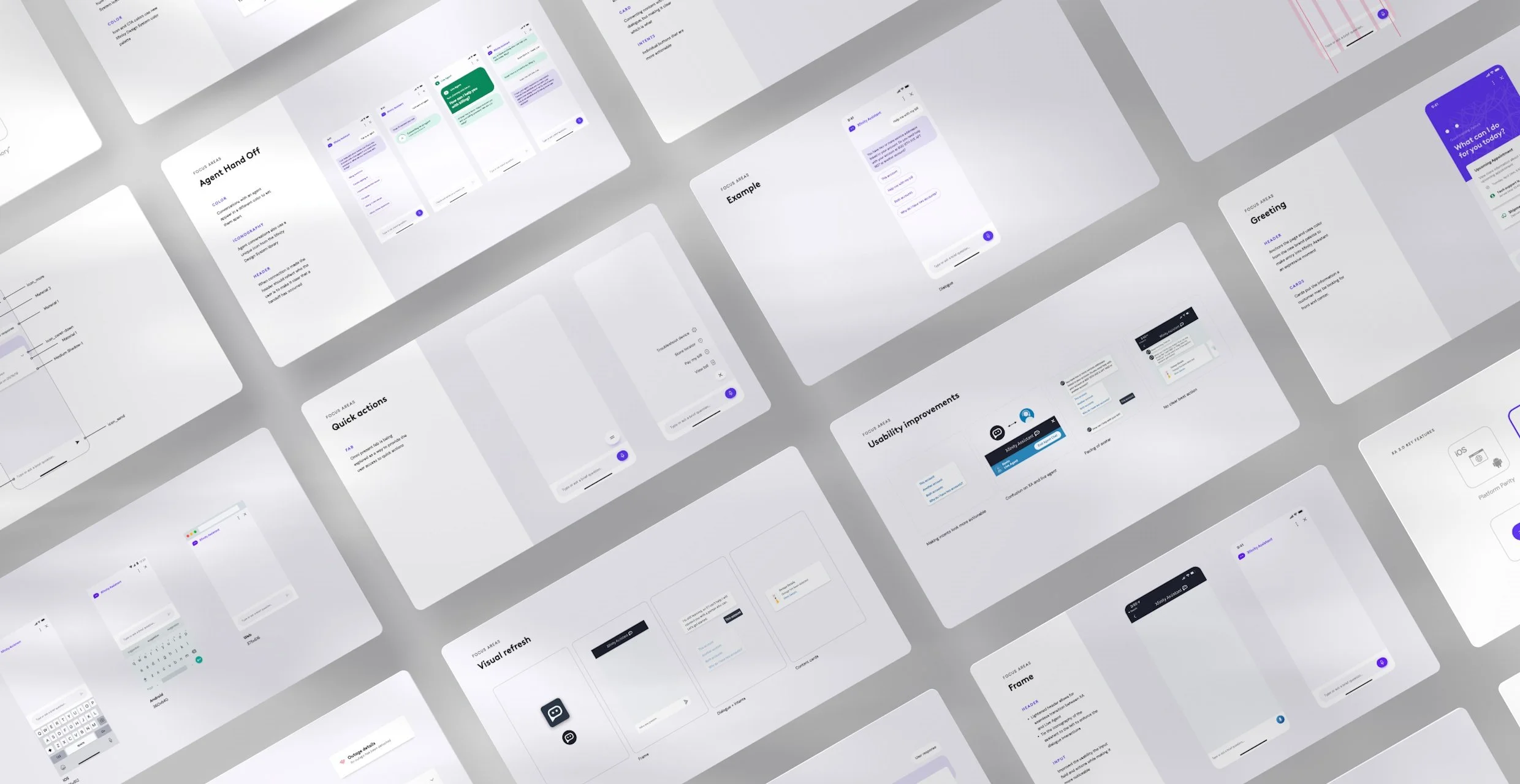
Scaling across platforms
When some of the initial work was completed, I facilitated workshops with platform teams to stress test concepts and see how they would work within their experiences. We made refinements from the initial concepts so they were more scalable across screens, worked in light and dark modes, and made usability enhancements in partnership with our research team.

Delivering the vision
To help the team move forward, the deliverables focused on current state requirements and constraints so it was grounded and actionable. I mapped designs to their APIs and aligned objectives based on their roadmap. To help the teams, I created a playbook of hero screens, reference animations, and a UI kit for the team to leverage for their build out. To provide support, I set up a series of check ins where they were able to present refinements and new ideas that we could provide feedback / guidance on.