Xfinity Brand Language
Making Xfinity’s brand a system
The Xfinity brand had always been marketing focused. To fill gaps, our product teams often had to make best guess solutions to fulfill unmet needs in our digital and product experiences. To help close the gap and ensure our product needs were more considered, I began working closely with our brand identity team providing creative and art direction. In collaboration with our brand identity team and brand agency, I had the opportunity to heavily influence the rebrand of Xfinity and push to ensure that the brand was flexible and digital first.
Typography & wordmark
In the past our marketing and product typography were different. Marketing typography leveraged Gotham, but was only licensed for use in marketing instances. Our product team had invested in creating a bespoke typeface, but was meant for readability and had no brand appeal. I saw this an opportunity to convince both sides to invest in one typeface that we could use across all display use cases.
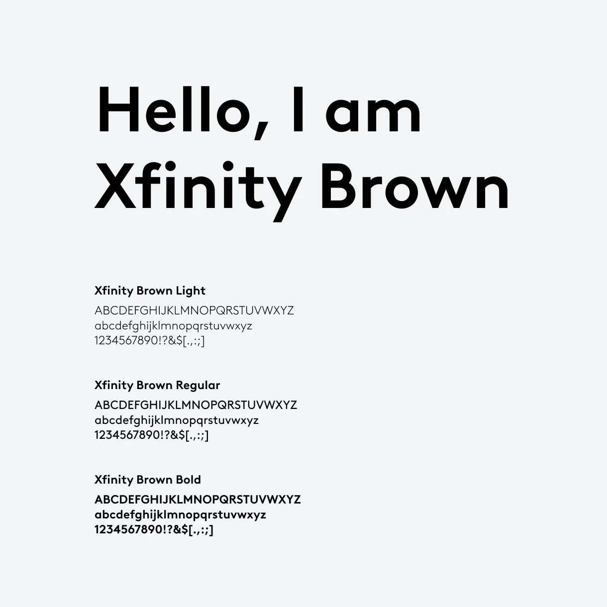
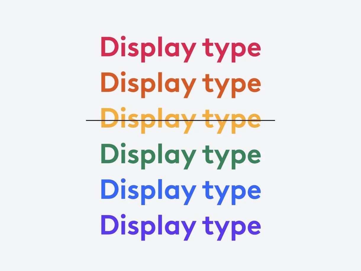
Xfinity Brown
Accessibility required increased contrast for type in our experiences. For the brand, we also wanted to leverage type as a design element so it needed to carry brand personality. We partnered with Lineto to customize Brown to met those needs.
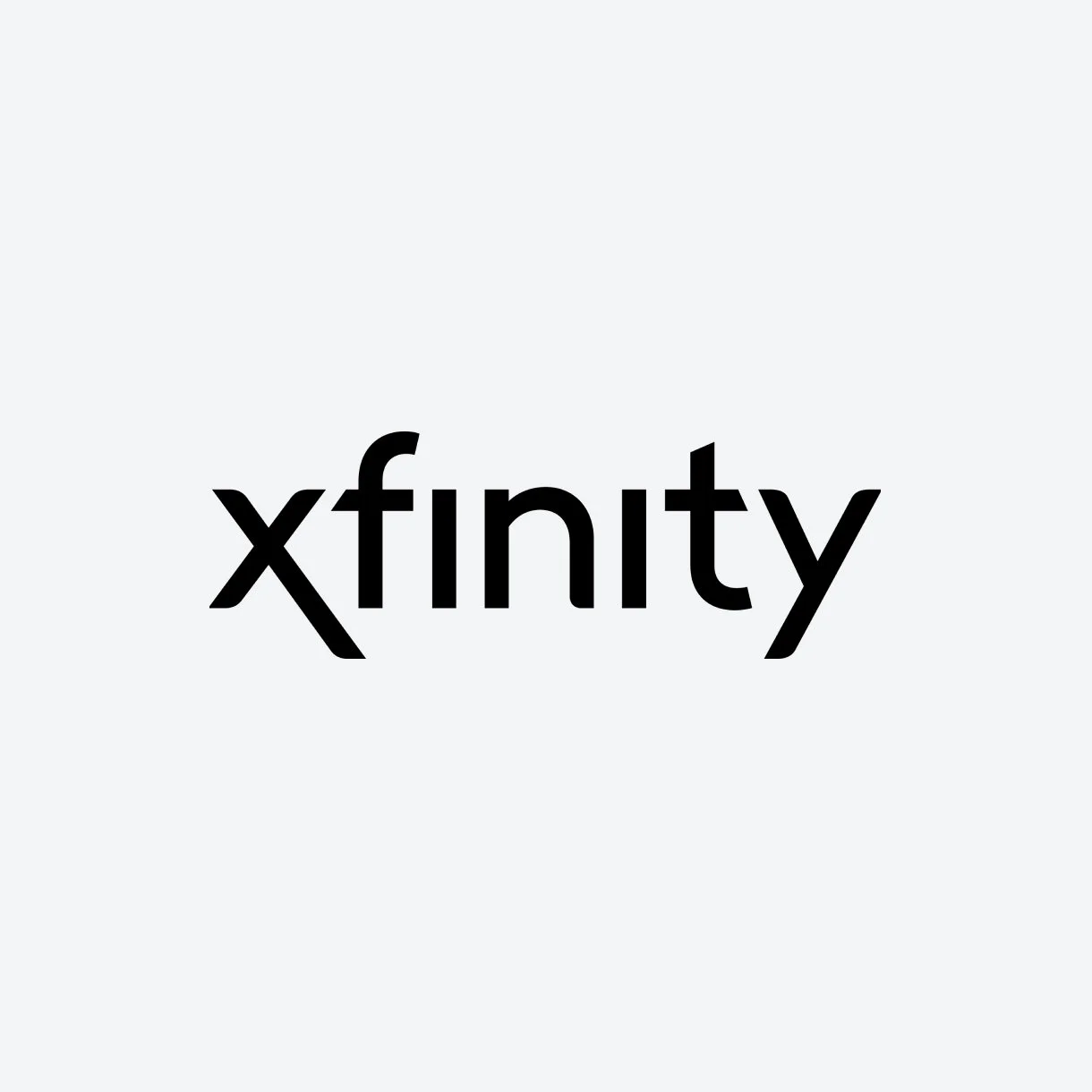
Wordmark
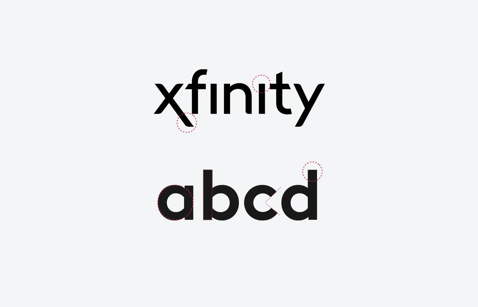
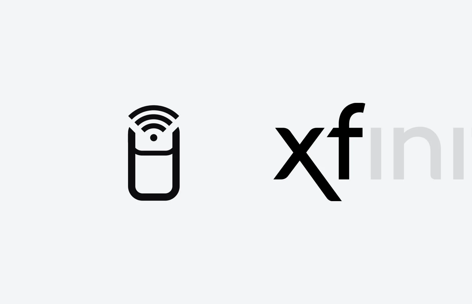
I advocated that we redraw the wordmark to take more influence from Brown. By using extended type, the logo feels more relaxed and open. The revised wordmark also takes cues from the shape language of our physical and digital products to soften the corners.
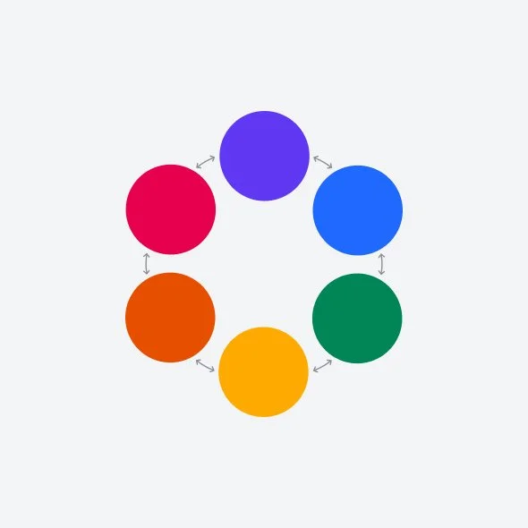
Color
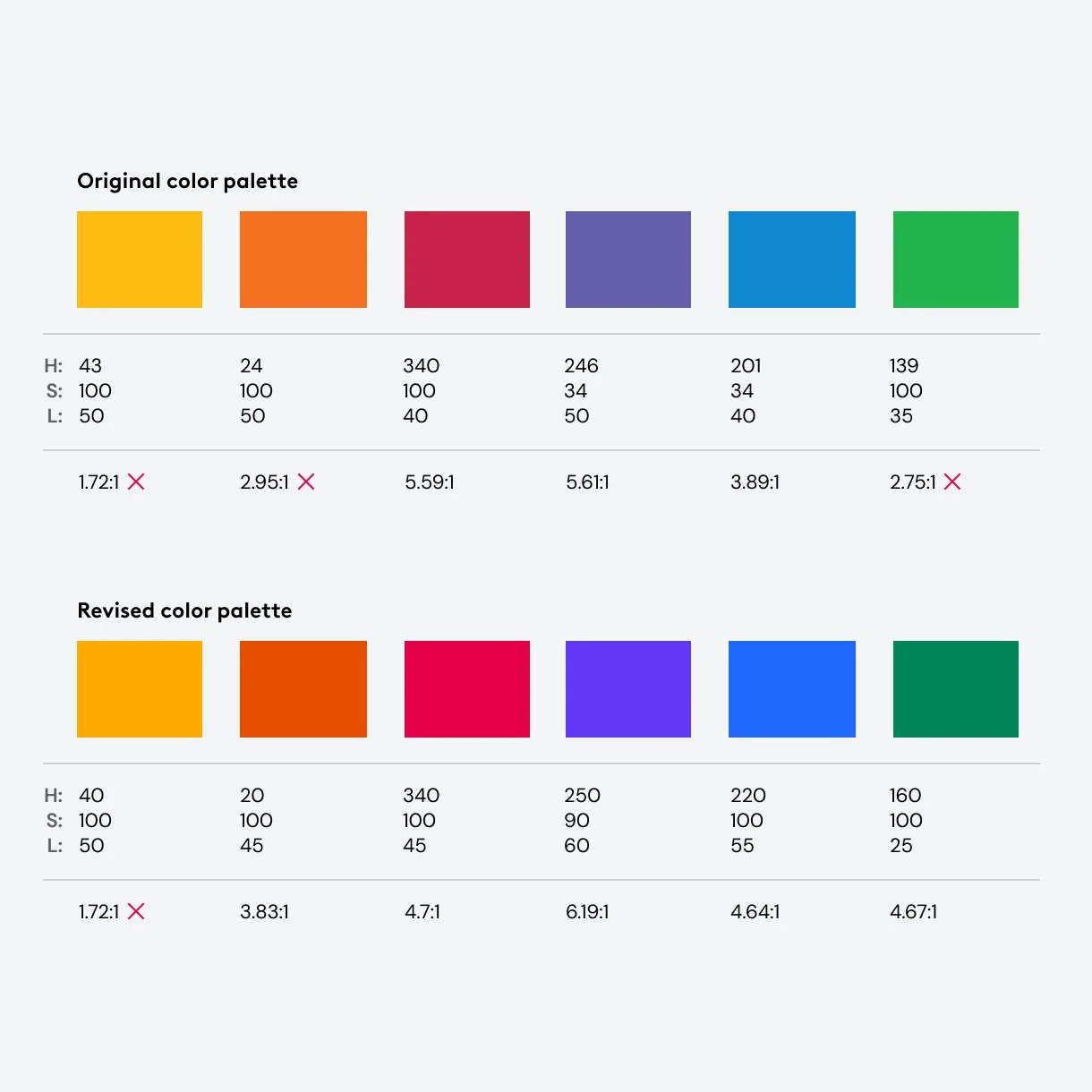
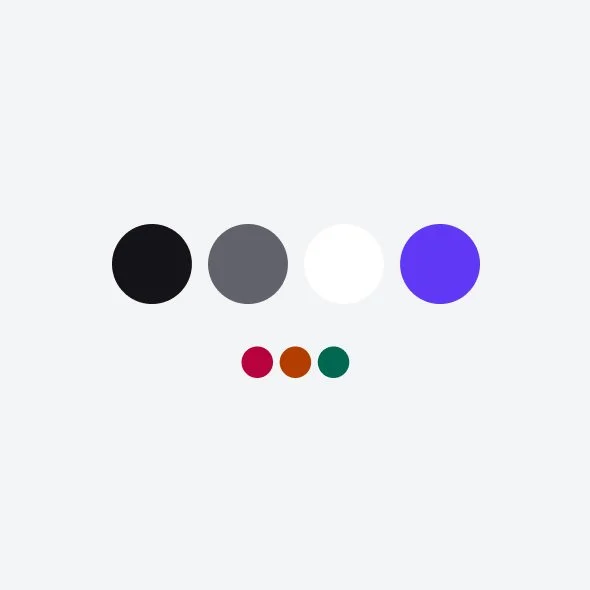
The Xfinity brand lacked color and felt very sterile. To help push for color, I noticed many of the other children companies of Comcast leverage the color spectrum (NBC, Peacock, Sky). Using this rationale we were able to convince brand leadership that it made sense to align ourselves to the same theory. Accessibility is forefront at Comcast, I was also able to ensure that our brand color decisions were accessible and would meet color contrast requirements. Having the most working knowledge of how color works, I took the lead to define our color palette.
Contrast refinements
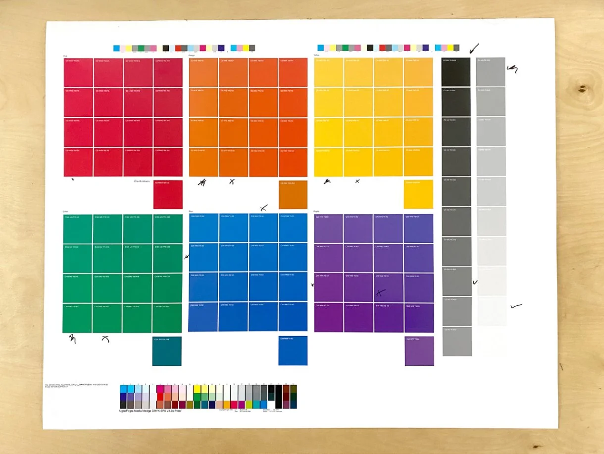
I knew the majority of our experience was going to be in light situations. In our study, many of the Comcast colors did not pass contrast requirements. This was an opportunity to refine the colors so that they were more balanced, digitally stunning, and contrast compliant. For final decisions, I used a minimum of 3:1 against white, which we were able to do except for yellow. To help ensure that contrast compliance is met, there is additional documentation for how to use yellow and 4.5:1 requirements.
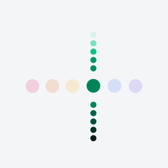
Color spectrum
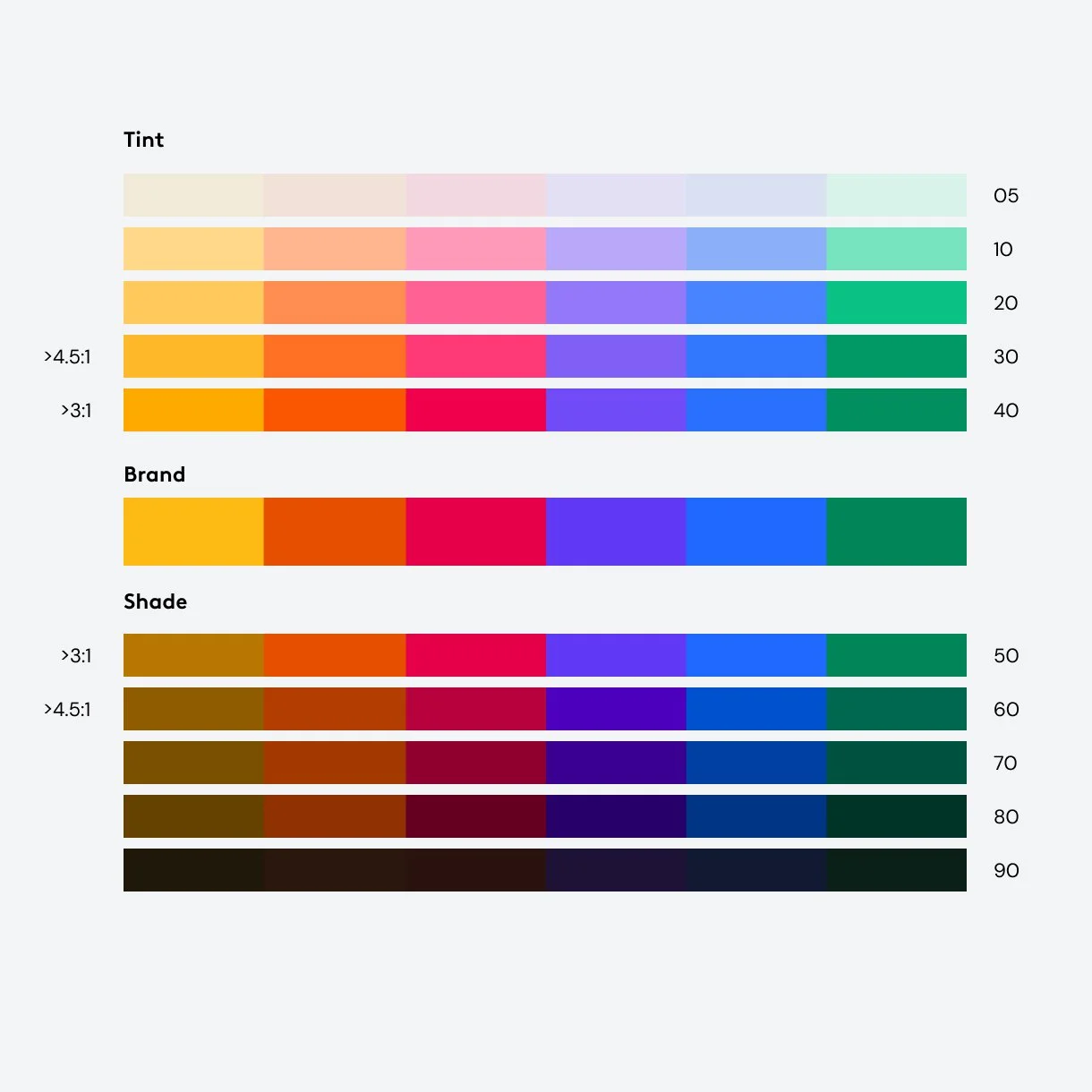
To help make decisions easier in our digital experiences and scalable, I also broke the brand palette into color spectrums. This helps informs how we use color for hierarchy, typography, and light / dark modes.
Color Studies
To stress test how to use color, I helped facilitate color studies to help inform how color uses. Partnering with the brand agency and internal teams, we were able to conduct print tests so that we could make the appropriate Pantone and CMYK adjustments and stress test decisions before making guidelines.
Color modes
Through the color study and workshops, the most important missing piece of our color palette was documentation on how to use it. Is there a hierarchy to the colors? Do we color code specific lines of business? How should color behave across the customer journey?
To answer these questions we created color modes that provide direction based on where the user is in the customer journey.
Embrace the brand
When employing tactics that allow for it, use the full spectrum of colors to highlight the new brand expression (digital, motion, sequential signage, etc.)
Make it personal
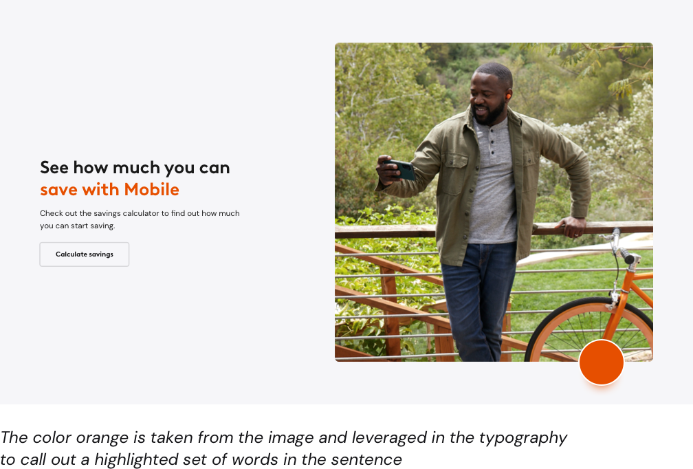
Make it personal uses empathy in its color decisions. The lead color is based on the key imagery within your communication with the spectrum to help with hierarchy.
Keep it simple
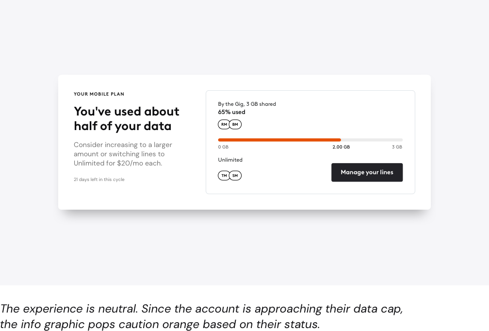
Primarily for use in our digital experiences, keep it simple has more structured and meaning to the color decisions.
What job are you designing for?
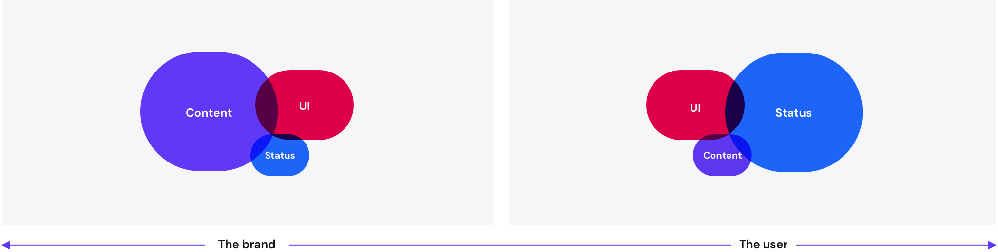
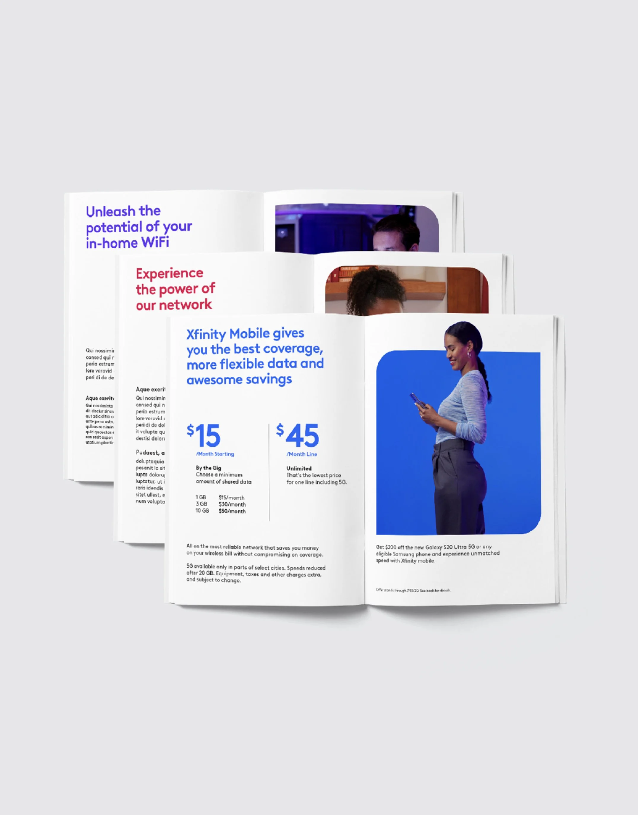
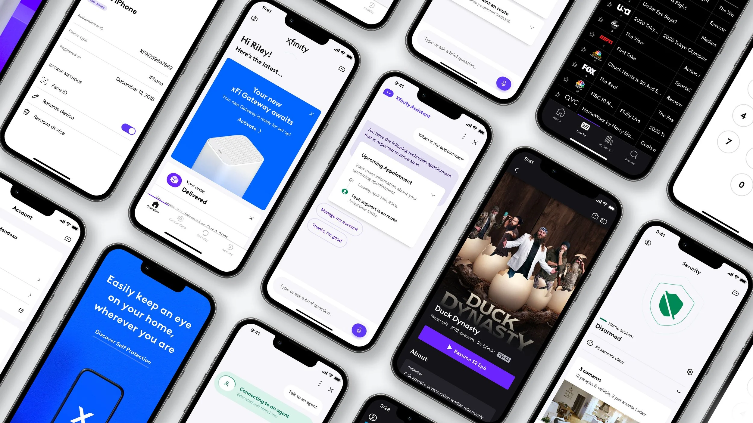
By understanding the goal of the experience, I created more specific guidelines to help inform how we apply color as a family vs. a literal transfer of decisions across all touchpoints. As a general rule, in our learn web experiences our core stakeholder is the Xfinity brand and the story we are telling is to a prospective customer. Therefore color is focused on storytelling and use the brand color theory. In our support and product experiences, we emphasize the customer with a simple focus on providing value. We reflect their preferences and communication / status takes priority.
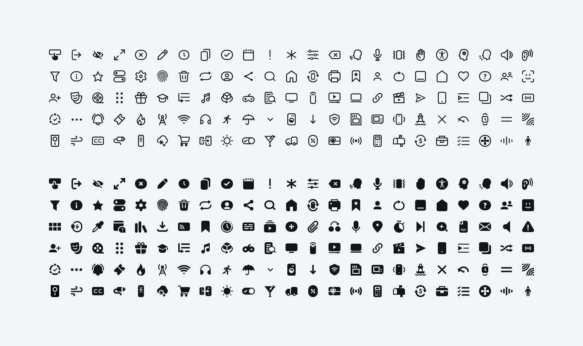
Iconography
Our iconography in the past was not holistic. Most often, feature teams or agencies would create their own glyphs that were inconsistent. Icons were also no centralized for teams to reference inside of their experiences. With the rebrand, our design language team took ownership, since the majority of use cases were focused on digital product use cases.
Icon style
Our icons take cues from our logo and typeface. They’re designed to illustrate our brand personality, aiming to balance our human side with function.
Key stylistic components to our iconography:
Geometric forms
Bold strokes
Mix of round and sharp joints
Square caps
45° angles
Uniform cuts
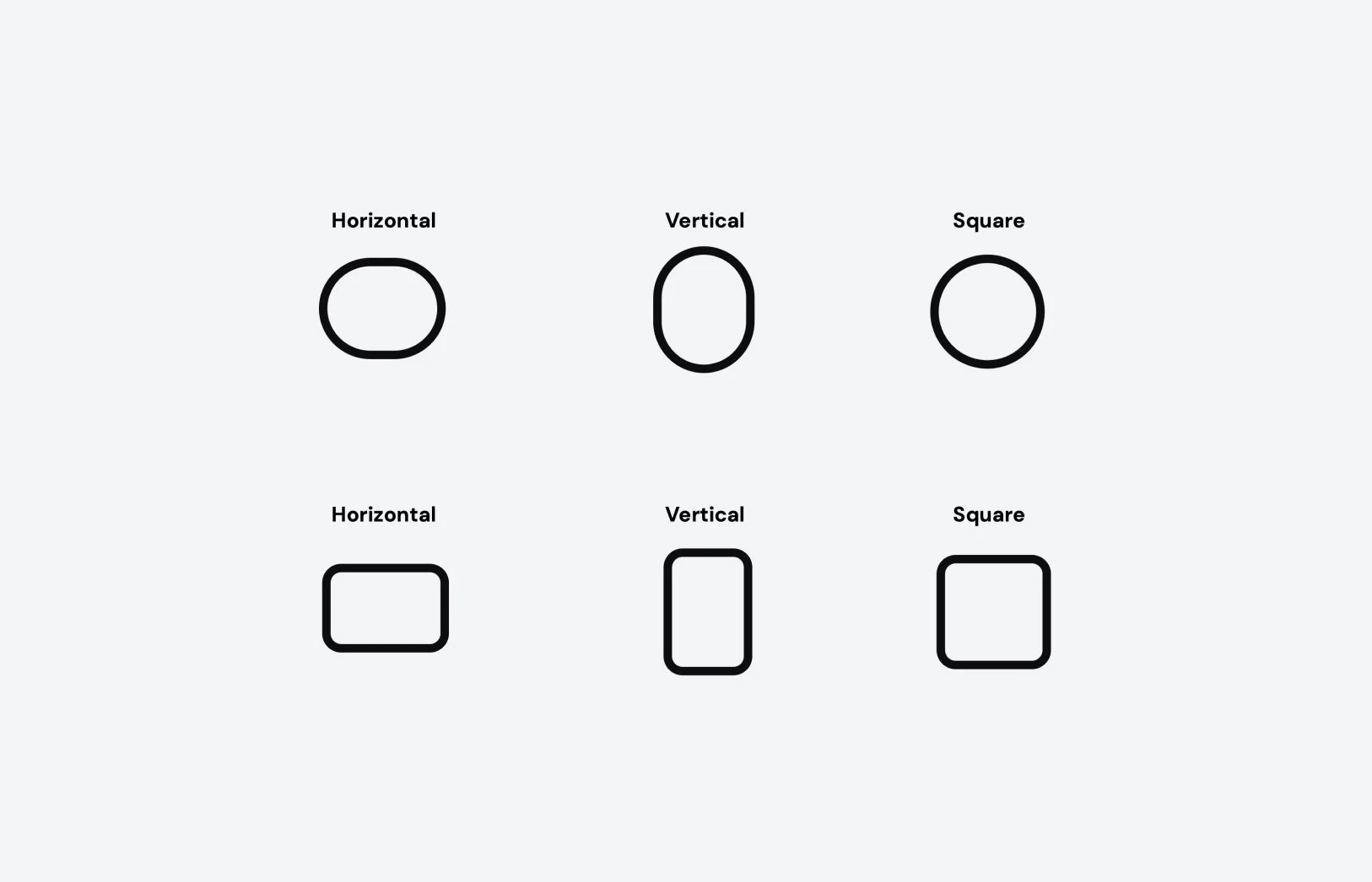
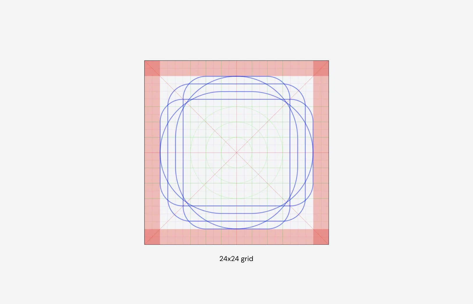
Key shapes
The iconography key shapes leverages quadrilateral forms with a corner radius that is just under creating a perfect circle. The extended style compliments the typography rules.
Pills
Rectangles with large corner radius applied to create a perfect circle on two sides when depicting round shapes
Rectangles
Rectangles with a defined corner radius to be used when depicting sharp shapes
Cuts
When lines intersect, forms overlap, or notification badges are needed we use cuts. To inform how the cuts are made, we took cues from the wordmark.
Delivering to teams
Once icons were created I wanted to ensure that we could standardize production and centralize the assets for teams to consume.
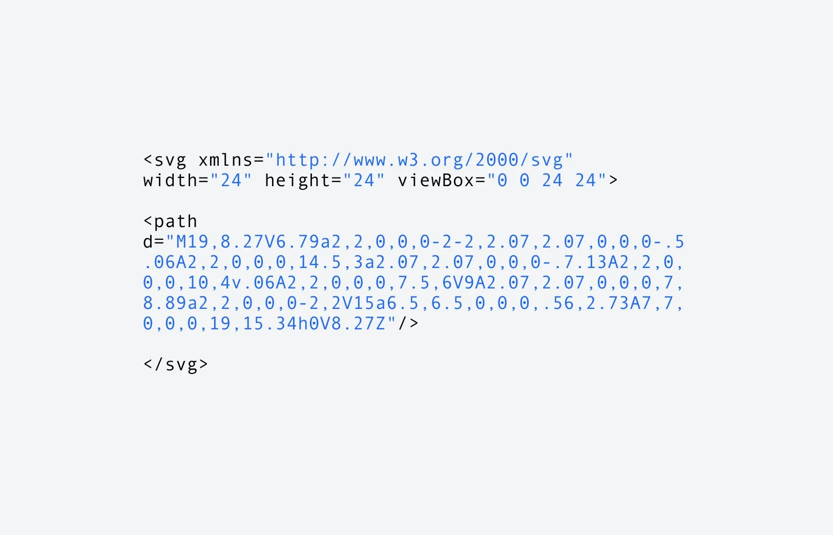
SVG production
Through a series of workshops with our internal teams, we created a standardized output of SVGs that would work across platforms.
Pipeline & Process
Icons are an ongoing required asset, so I helped document and communicate to the product teams an ingest process and pipeline. Our engineers from the design system were able to automate those decisions to save time and create consistency.
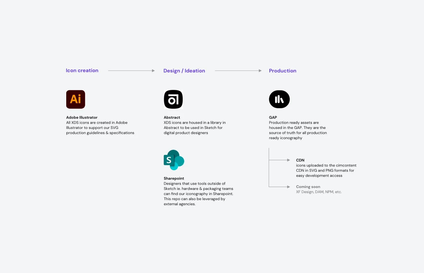
Naming convention
Our icon exports follow a naming convention that is predictable and consistent. For instances where pngs are required, we add additional attributes.

Tooling
To make finding icons easier for teams I partnered with our engineering team to create a front end tool. The tool allows users to explore icons that are available, find associated meta-data, and change their size or color. For web teams, we point them to a CDN and for native teams they can quickly get production ready assets for their products.
Imagery
Imagery was a collaboration between our brand agency and internal teams. For people and lifestyle imagery, our brand agency handled the casting, photoshoot, retouching. I focused on digital and 3D assets as our product teams leverage that content more often and could offer more of that perspective to imagery.
Similar to color, there are 3 modes to the brand and that applies to our imagery.
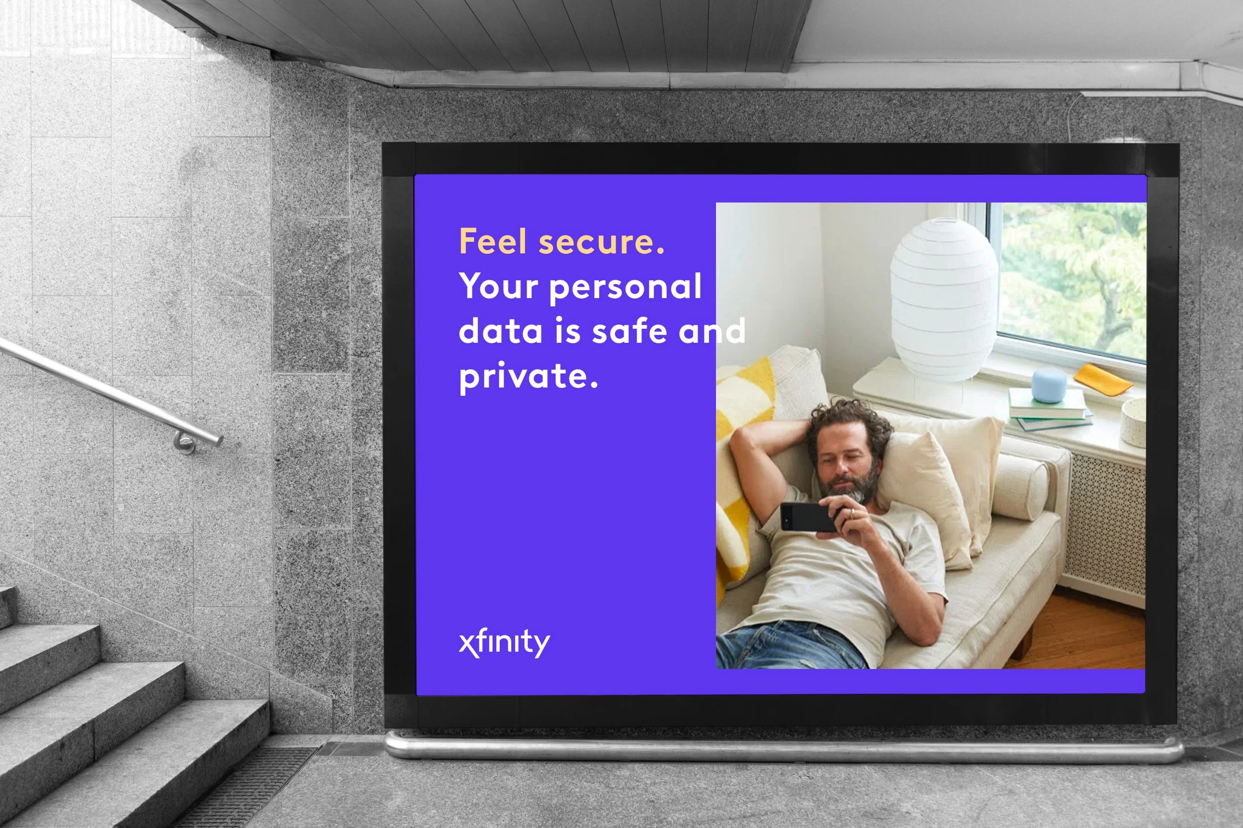
Expressive color world
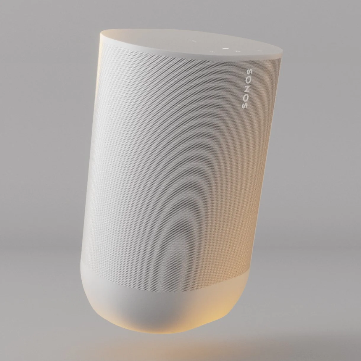
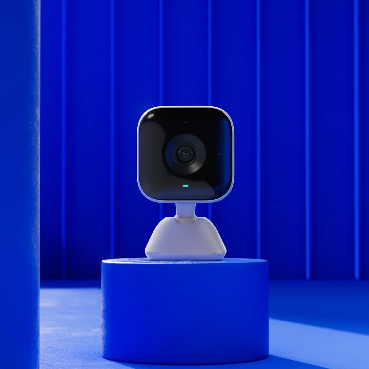
Expressive Color World captures the essence of the Xfinity hardware to the fullest extent of the brand. Hardware and people are the hero within abstract environments / studios informed by Xfinity shape language. Expressive worlds feature either a single brand color or combination of brand colors depending upon if the environment is a full flood or a color pop execution.

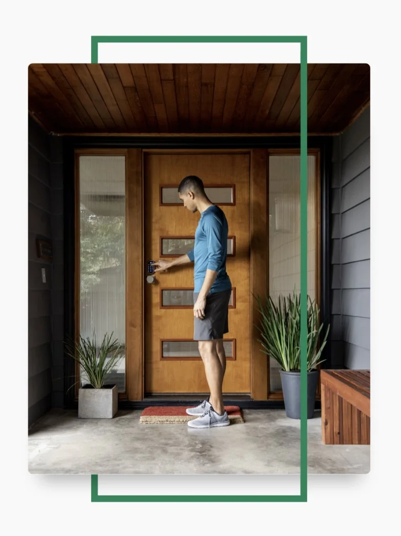
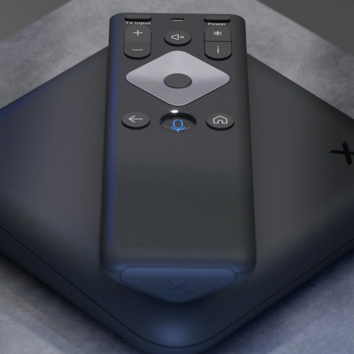
Semi-real world
Semi-real world captures the brand essence of Xfinity by presenting people and hardware in both natural, real-world and curated, artistic fashions. Brand color is represented in objects and soft colored light. Semi-real world imagery contextualizes things so that people understand scale and how experiences relate in their home.

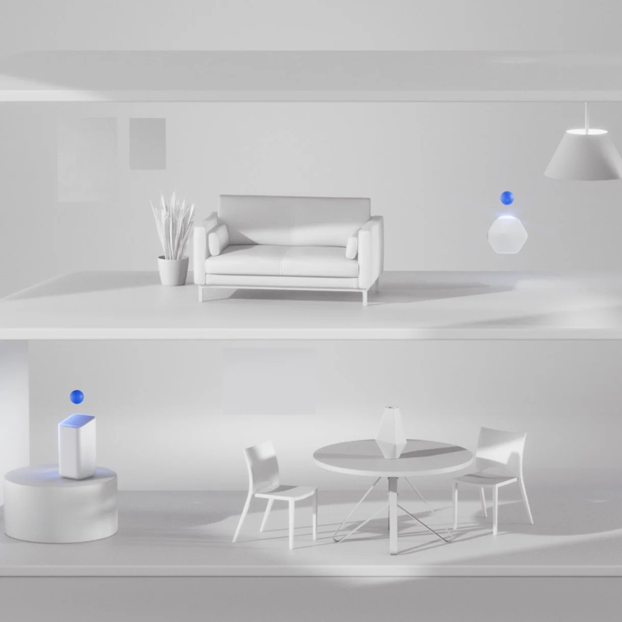
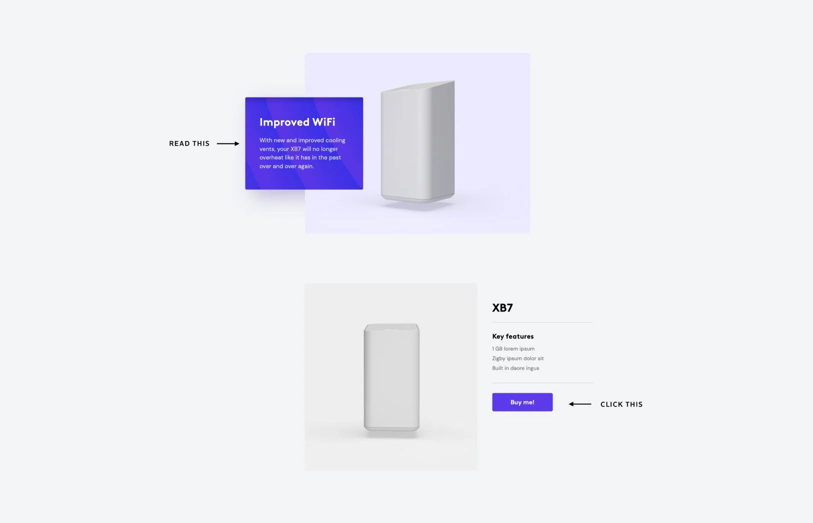
Neutral world
Neutral world is a versatile space that is primarily digital or simulated. This world was created for communicating information with minimal visual complexity. Neutral materials and colored lights are also a way to bring third party hardware into the Xfinity brand language.